Throughout our lives we see a lot of statistics and data, whether it’s as a bunch numbers in a list, data in a table, or even in some type of graph. However, for the most part, people get bored and lose interest in them very quickly because it doesn’t grab their attention. Then people started to create infographics as a way to show the data and information in a unique and interesting way that people are gravitated towards. Since then, people have been displaying data and statistics in different and creative ways by using pictures, everyday objects, and anything they can get their hands on.
Sarah Illenberger, has been creating these visual images to display statistics using everyday objects like plants, flowers, food, and clothes are just some of what she uses. Antoine Corbineau displays information by creating images in a unique design (abstact and not abstract). These are two of many people who made captivating visuals that are not just a simple bar graph, line graph, scatter plot, or pie chart.
As someone who loves to read it almost seems rare these days. With all the new technology advances, social media, movies, and even tv shows, people are refusing to read anymore. In fact, for many people it’s like it’s a one of the worst chores they have to do and they feel forced to read. I used to dislike reading until I found the right book and author and now I can’t put the book down. So what would happen if I created a captivating visual about reading? Would it influence others to read more?
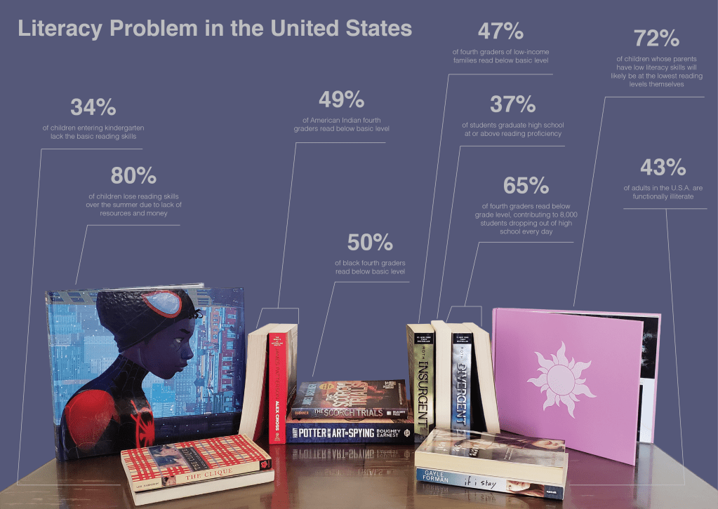
In the visual, I obviously used books as it’s all about bringing attention to the literacy problem in the United States. I used books of different sizes to represent the different percentages. There are some where I used two books to get to that percentage and either had them standing next to each other (49% and 65%) or laying down on top of each other (34%, 50%, and 43%). I did this in order to make the visual more captivating and not just all in one line straight across since it would be boring and people would lose interest in it quickly. For the most part I was using the book’s thickness to represent each statistic, but I wanted to change it up a little bit to add to people’s interest and to show the statistics in a different way. I used the size of the covers of the two books on the side that were the Spider-Man: Into the Spider-Verse -The Art of the Movie on the left to show 80%, and the pink book on the right to show 72%. Since both of the covers are the largest of all of them, they had the two largest statistics. As for the color of the background, I choose a darker color to show the seriousness of the statistics and how it’s not good at all, but one that also looks hopeful to show that we as a country can improve the literacy within kids and adults.
Visuals capture society’s attention way more often, especially now with all the technological advances and everyone starring at screens all day long watching shows, movies, graphics, or even looking at pictures. Graphs and charts are no longer interesting. Instead, we now have to create new images that are captivating while conveying the importance of the message that the visual is trying to portray.
Resources:
- Corbineau, Antoine. Antoine Corbineau • Illustration & Design, http://www.antoinecorbineau.com/.
- “Density Design.” Visual Storytelling, by Andrew Losowsky, pp. 10–17.
- Eckstein, Linda. “Sarah Illenberger’s Infographics.” ALL MY EYES, 5 Oct. 2010, allmyeyes.blogspot.com/2010/10/sarah-illenbergers-infographics.html.
- “LITERACY FACTS & STATS.” Reading Is Fundamental, 11 Mar. 2019, http://www.rif.org/sites/default/files/LiteracyFactsStats_3.11.2019.pdf.
- Rea, Amy. “How Serious Is America’s Literacy Problem?” Library Journal, 29 Apr. 2020, http://www.libraryjournal.com/?detailStory=How-Serious-Is-Americas-Literacy-Problem.
- Reading Is Fundamental, 26 Aug. 2020, http://www.rif.org/literacy-network/the-issue.
