Do you know how much of our emotions and color can affect advertising? Do you realize how much of our emotions are affected by color? Have you noticed the trends happening in movie poster designs? Whether we know it or not, we are constantly being influenced by ads promoting different types of products and brands. It also gets carried over into the film industry and in particular into the design of all the movie posters.
We hear rumors about films being made and what celebrities are starring in them. However, the posters that were designed for all these films are really what gets the word about the film spreading across the world. How are these posters supposed to influence people to go and see the movie when it’s just a still visual and the trailers that come out afterwards steal the attention away from the posters? Well, colors, icons/images, and even the typography that is used for the title and any names that appear can create an impact, evoke emotion, and become memorable if it’s done right.
Emotion Through Color
We learn about colors at a very young age. Throughout our lives we use color in basically everything we do from coloring, creating designs for anything, picking out what to wear, choosing what to buy, and in anything else we do. But how do we know that our decisions were based on the colors or not? To make it even more interesting, we are taught that many of the colors relates to one emotion, so blue means sad, red means anger, and yellow means happy. When in reality the colors can represent multiple emotions, depending on the context of what it’s in. So now red symbolizes anger, love, and passion, blue symbolizes sadness and calmness, and yellow represents happiness and caution. Robert Plutchik created his own wheel of emotions in order to understand it more and show the relation and intensities the eight primary emotions have with each other which includes: anger, disgust, fear, sadness, anticipation, joy, surprise, and trust, as seen in the visual below (Interaction Design Foundation).
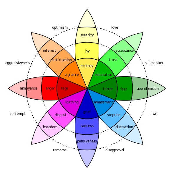
Depending on what the visual is supposed to be showing the colors can add to different intensities where terror is the most intense emotion of the primary emotion of fear and apprehension is the least intense (Interaction Design Foundation). In fact, emotion and color also relates to each other where there different shades and intensities of a color in order to evoke certain emotions out of people and whether the designer wants it to be a strong and extreme feeling or the opposite.
Colors allow the audience to feel different emotions than the next person even though they are looking at the same visual. The designer may intend to induce emotions through the design, but because emotions reside in the user of the product rather than in the product itself, the emotions the user experiences are not necessarily the same as those intended by the designer; some of the emotions the user might experience might have been intended by the designer, but some might not or it’s the opposite of what was intended by the designer (Norman and Ortony). Numerous art pieces, for example, evoke different emotions with everyone and unless the designer is very careful and specific in their choices this will continue to happen. However, with all of the different views and emotions out in the world the consumer can see all these advertisements and visuals and see a story that they relate to or are interested in and end up purchasing the product, ticket, or whatever is being promoted. Now how does this translate over to movie posters as they are used to advertise a new film?
Color and Emotion in Advertising
Advertisements can be commercials, pages in a newspaper and magazine, or in this case a movie poster promoting a new movie before it is in theaters. A well designed and successful advertisement for a product stems from the color. Using the wrong color can send the wrong emotion and message to the audience. Each color has a certain meaning and can have more than one emotion attached to it. So the message, story, and even the emotion the audience feels can highly depend on the color that is used along with any other trends or principles the designer decides to use. In fact, Saul McLeod mentions how a lot of information reaches the eye, but much is lost by the time it reaches the brain and a psychologist, Robert Gregory, estimated that about 90% of that information is lost (McLeod). Knowing this the advertisement needs to be strong and powerful from the start, actually more like at first glance, in order for the product being promoted to be memorable. In reference to movie posters, this could be the color, the emotional impact it had on the viewer, or the icons or images on it.
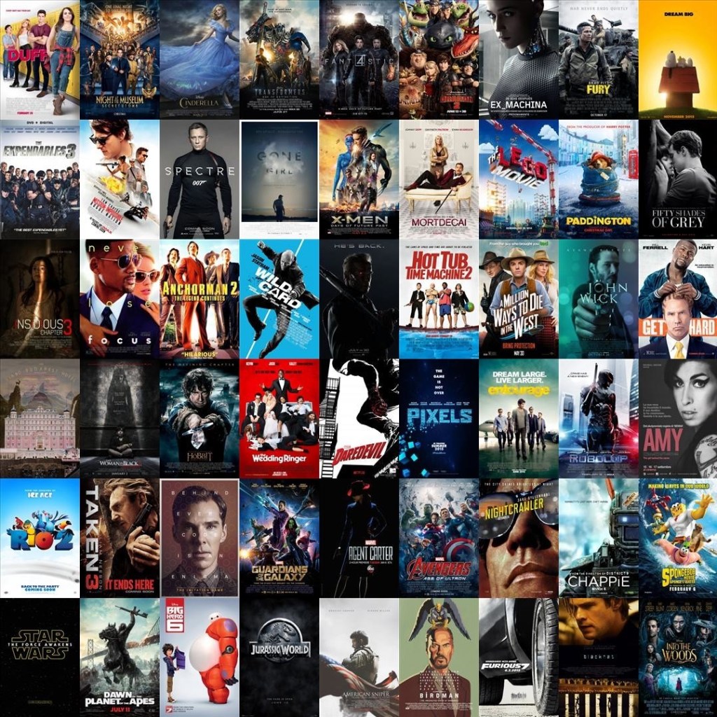
Along with the people and objects in the image, the colors come together to add to the genre of that particular film. So for example, the color red may not always be for romantic movies and blue may not always mean it’s a sad movie. Andrew Losowsky even states that “Sometimes, a designer will intentionally aim to maintain a sensation of continuity between the color scheme and the typography and the tone of the information itself. At other times they might try to invoke contradictory emotions between a piece’s visual language and the nature of its content, in order to shock or delight the viewer,” (Losowsky, 4). Looking at the collage of movie posters above you may take a glance and see that certain posters evoke certain emotions that you wouldn’t expect from the colors and images that were used.
In the article, Impact of Colors on The Psychology of Marketing – A Comprehensive Over View, Nayanika and S.K. states that “Colors have always played a significant role in impacting one’s mood, emotions, cognitions, sensations and perception (building blocks of psychology)… Colors do not function separately and individually, but from multi-layered references.” Whenever we see movie posters, it affects our emotions right away whether we know it or not and we automatically think the movie will be scary, happy, or sad right away by seeing the more prominent color right away. However, because there are other colors in the posters as well as the images it changes our perception of what we thought the film is going to be.
Red
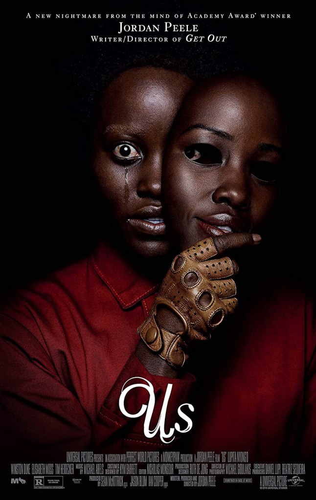
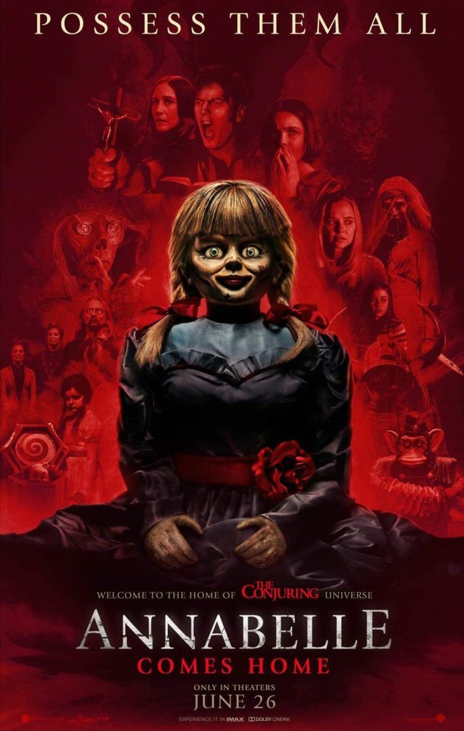
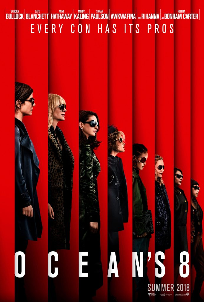
Within the posters for the films Us and Annabelle Comes Home, the color red is front and center and by seeing the facial expressions of the people and doll as well as the other colors like black adds to that terrified feeling that goes with the horror movie genre. You can also tell that the story each of the movies are going to tell is not going to be a happy one, but instead a dangerous or life threatening one since red can represent danger and evil. What happens if the color red is used in a different way? The first two posters uses the darker shades of red to invoke the emotion of fear, but the Ocean’s 8 poster uses a lighter shade. While it also has similar colors (red and black) it doesn’t express fear but instead it expresses determination and passion. As mentioned before, the color doesn’t function individually, and in this case the actor’s body language and expressions aid the colors in evoking the emotion from the audience as well as helping advertise to the audience that it’s going to be a dramatic film. What if it the color isn’t as prominent like it is in the posters above?
Colored Text
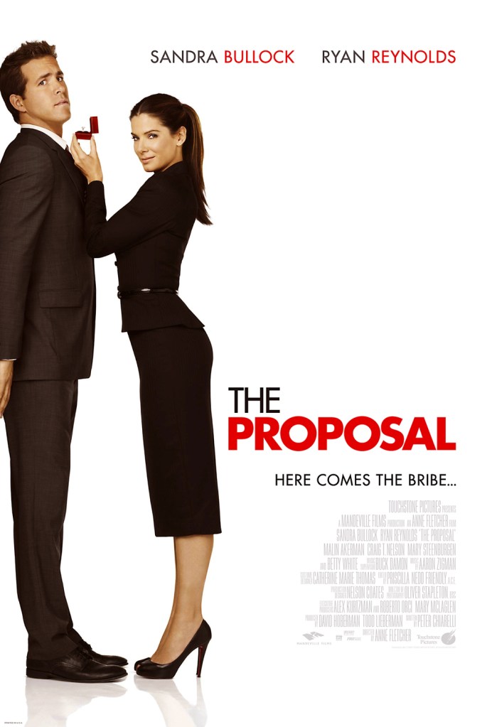
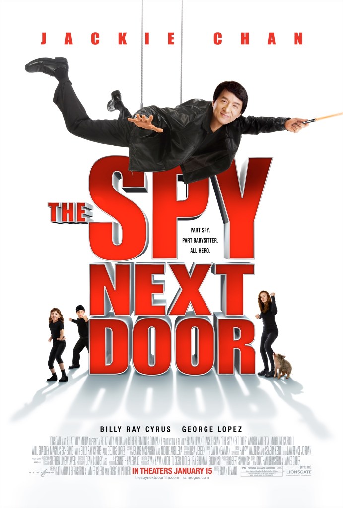
Mitsuhiko Hanada states that “Color meanings can be thought of as associations by conventions or regulation, and people do not necessarily feel some emotion when they see a color representing a symbolic meaning.” While we are so used to seeing color in the backgrounds or in objects and clothing and associating a certain emotion with it, designers have been using color in different ways like as the color of the text on the poster whether it’s the title of the film or the actors names. As Hanada was saying that the color meanings isn’t what people feel each time they see that color. That’s the case with the posters for The Proposal and The Spy Next Door. In fact, in the way the artist used the color, along with the people on the cover, it adds to the comedy of the film as well as evoking the emotions of love, surprise, and trust.
Yellow

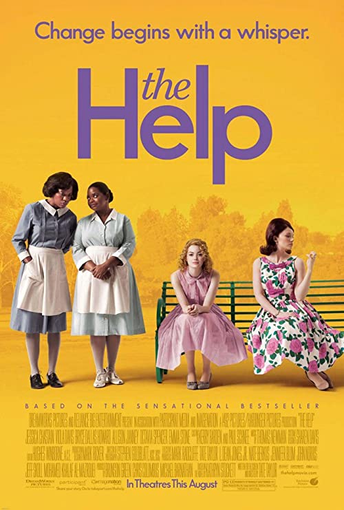
Whenever we see the color yellow, we instantly feel happy and joy. Within the first two movie posters we see actors who are comedians and have done comedies in the past, so we automatically assume it’ll be a story that will make us happy and laugh. Also, even though they have serious expressions the yellow adds light and joy to the story of the overall film. Colors in advertising can help set different tones and moods to what is being promoted, which is prominent in The Help poster. Even though it’s still using the color yellow like the other posters, we can see that set during the Civil Rights movement by the actions and outfits of the characters. So in this case the color adds optimism and that feeling of anticipation to the story of the film as it’s all about wanting change to happen for a better future. So it’s not always about being happy and joyful whenever yellow is added to the visual.
Blue
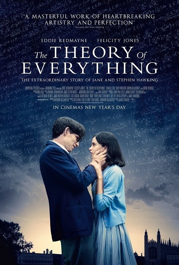
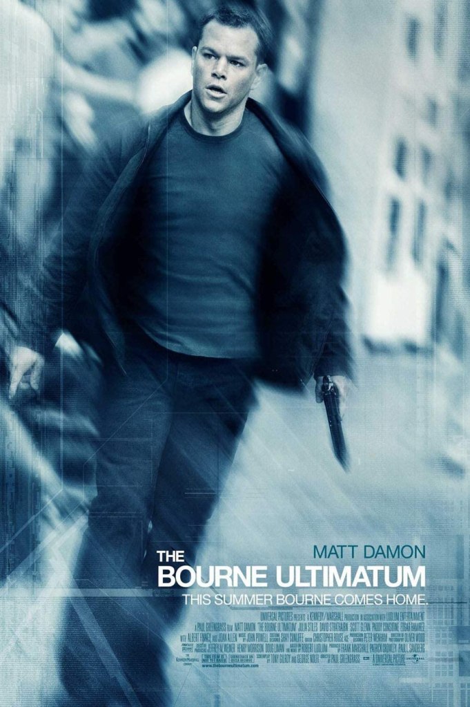
It has been mentioned before that there are different intensities of a primary emotion explained by Robert Plutchik. Well if a poster is designed very well in that the designer is able to create a poster that can evoke three different intensities of an emotion within one visual then there would be a more powerful response as the film is being advertised. Color is able to do just that by using different shades and intensities. For example, obviously we associate the color blue with the emotion of sadness. The poster for The Theory of Everything can express grief, sadness, and pensiveness which are three intensities for the primary emotion of sadness. Then, the poster for Bourne Ultimatum can evoke the emotions of terror, fear, and apprehension which are three intensities of the one emotion, fear, all at the same time. An advertisement can also be just as powerful when the audience can see how intense one emotion can become throughout the film from beginning to end in one still visual. The poster for The Theory of Everything does exactly that as well as being able to show three intensities of one emotion as mentioned before. It uses blue to express the emotion of sadness and the background includes different intensities and shades of blue that it tells the audience that it starts out great and as the story goes on it gets sadder and sadder.
Using Multiple Colors to Express Emotion
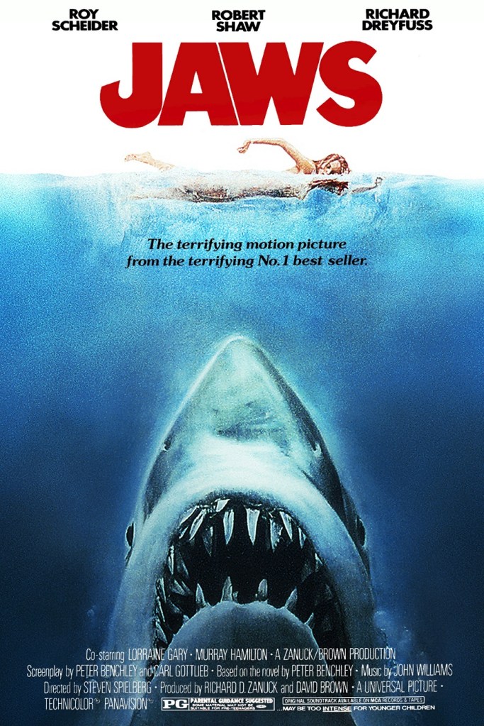
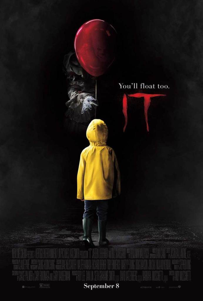
While posters sometimes use one color to really evoke a certain emotion from the audience for that genre, there are some that use multiple colors to get the audience thinking differently than what they thought originally. For example, the poster for Jaws and IT uses two to three colors that gets you thinking what the film is really about. When we think of blue it usually represents calmness or sadness. However, in this case it is all about fear and terror as the color gets darker as it goes down to the shark, with assistance from the red text symbolizing danger. So putting the two colors together in the this context the designer is helping to advertise a horror and thriller film. Then with the poster for IT the dark shade of red also symbolizes danger with the help from the majority of the poster being black. Yellow stands out in this poster but for the opposite reason. Instead of representing joy or happiness, it really symbolizes caution. Pola Zen talks about “how the amount and type of lighting that a picture has, along with the level of contrast, immediately affects how we feel about it,” (Zen). The poster for IT really uses lighting to its advantage in order to capture the emotion and story all in one. There isn’t much light on the clown showing that he’s always in the shadows and is up to no good. Also, not only does it show that something bad is going to happen in the movie, but it also adds to the emotion of fear and even terror that the audience should be feeling.
Gestalt Principles in Movie Posters

Gestalt principles with color can create unique designs within visuals. The figure-ground and simplicity principles of the gestalt principles can be seen within one of the teaser posters for the film Black Swan. The figure-ground principle include one element to perceived as the “figure” element where the focus is and the “ground” element that’s the background of the visual (Busche). In this case, the swan’s head is the “figure” part with the “ground” part being the dancer and her arms and hands as they make up the body and feathers of the swan. One can say that the gestalt principle of simplicity can also be seen within the Black Swan poster. This principle is all about having simple icons and images that come together to create a unique design (Busche). We can clearly see that there are two separate images, the swan and the dancer, but together that create a visual that is captivating and unique. Along with these principles, the colors black and red adds to the story and emotion the audience should feel as it expresses anger, disgust, and even loathing so we know that it’s going to be a dramatic and intense film.
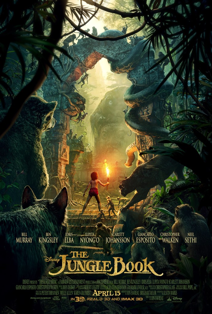
Now, within The Jungle Book poster the more dominant colors that are shown are green and yellow-orange. Green expresses jealousy that Mowgli has against the other animals who are able fit in and the yellow-orange expressing the hopeful feeling that at some point in the movie, Mowgli will find his place among the others in the jungle. The gestalt principle of symmetry plays a role too in it the way that the elements within the poster are perceived as part of the same group (Busche), with the elements being Mowgli and the jungle with the animals. Furthermore, the principle is shows the audience that Mowgli provides a balance in the jungle and to display to the emotion of acceptance that the animals eventually have with Mowgli.
Trends in Movie Posters
Movie poster artists don’t just use the gestalt principles in their designs. But have you noticed any trends that have appeared in movie posters lately? Many people may not notice these trends unless they are really looking for them. Amongst the many trends, color schemes and minimalistic designs are two trends that are very popular these days.
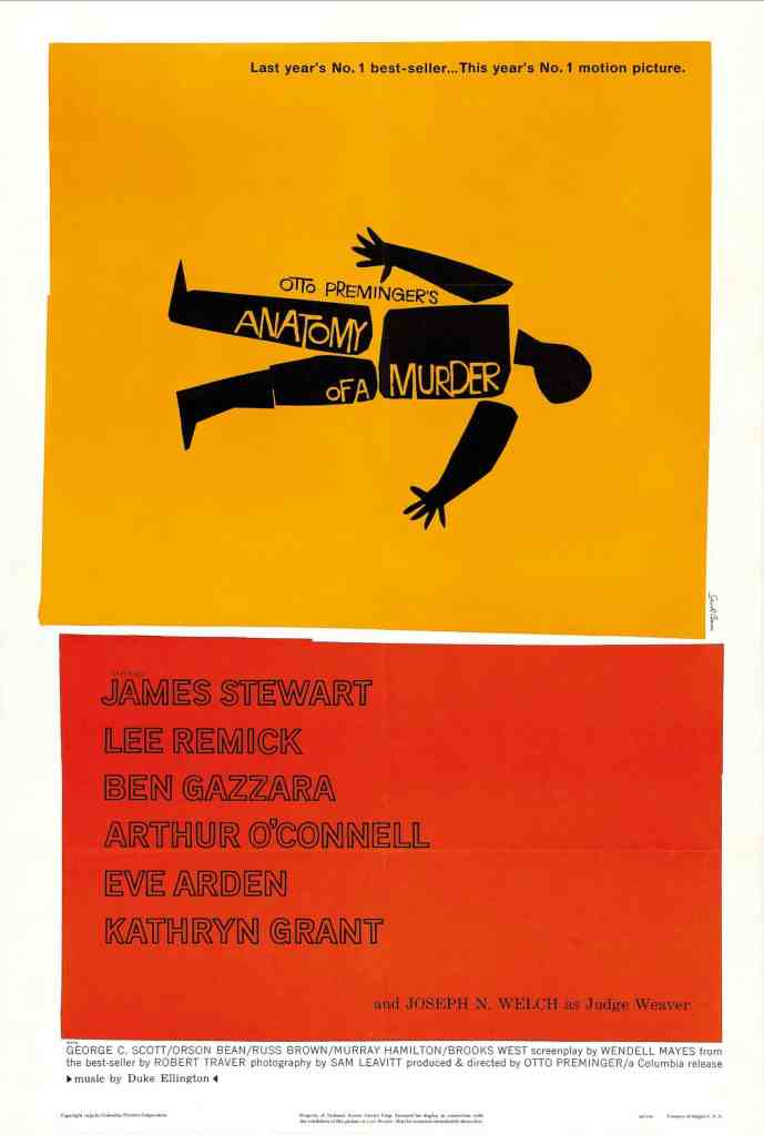
Saul Bass was one of the movie poster designers that really used the minimalistic approach in his designs. He created the posters for Anatomy of a Murder (seen above), Vertigo, West Side Story, The Shining, and so many more. This minimalistic approach allows for typography to really take the spotlight in the design with the aid of a couple of visuals. These visuals are in the simplest form it can possibly be that helps to tell the story of the film. A lot of the time they are just simple shapes that mostly use squares, rectangles, and circles. In fact, José Rufí talks about how within the design of the movie poster: less is more, and that “…simplifying the graphic and textual elements to achieve a powerful, attractive and striking image. Reduced in its graphic part to a single motif and far from collages and more complex compositions characteristic of previous stages…the minimal is characterized by its order, purging, geometric purity and formal simplicity, its pure colors, or the immaculate surfaces, in such a way that it implies a return to austerity and simplicity,” (Rufí). So instead of having all intricate designs, collages of images, and an overall abundance of information being presented in one visual, the minimalistic approach allows the designer to get right to the point of what the film will be about by creating a simple yet powerful visual. Françoise Mouly states in her Ted Talk, “The Stories Behind The New Yorker’s Iconic Covers” that “sometimes some of the images that say the most do it with the most spare means. And a simple image can speak volumes,” (Ted Talk). That’s exactly what artists do when they use this type of approach. Most of the time you don’t need all these fancy graphics, insane photo collages, or anything that can be distracting and just have a simple image that quickly tells a lot about the film.
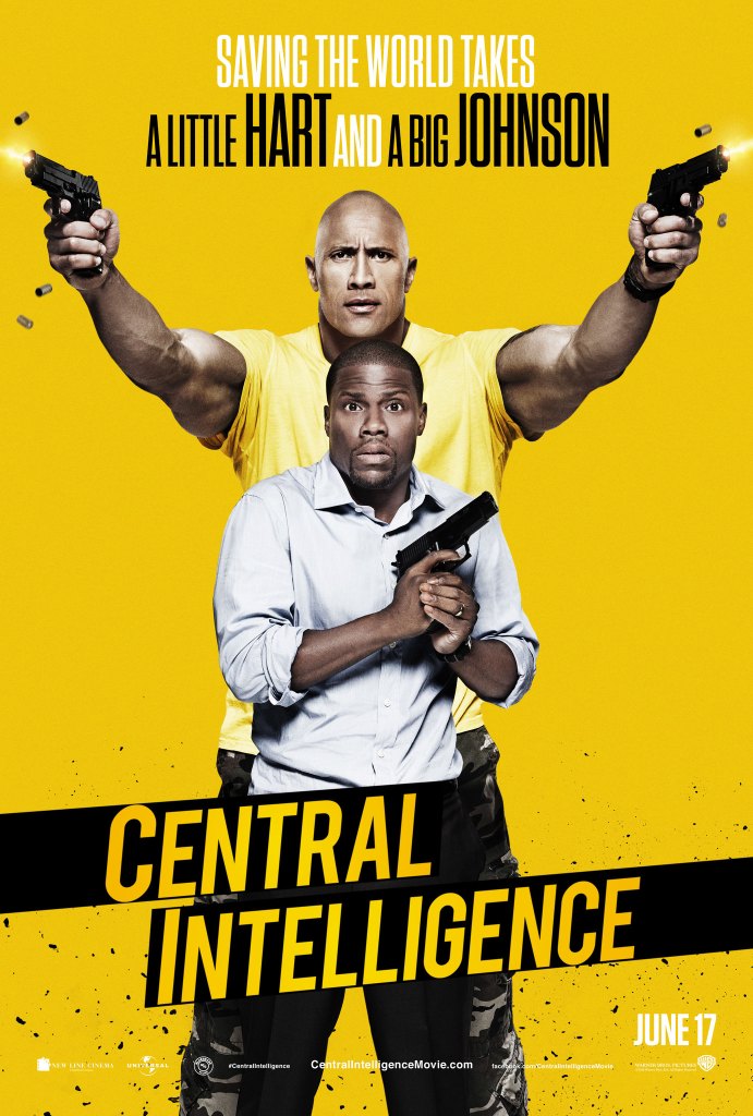
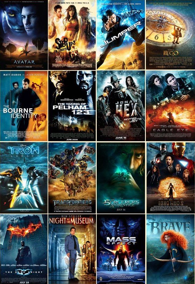
Color schemes has also been a trend that designers have used in their movie poster designs. This could include posters being all blue, blue and orange (like the image above), red and white, yellow background, and even posters that are black, white and orange. James Verdesoto, is a famous movie poster artist whose works include the posters for Pulp Fiction, Training Day, and Girl, Interrupted just to name a few. He talks about color schemes within the designs of movie posters and some other elements that can be found in each of these color schemes as they relate to a specific genre. For example, he says how with the blue and orange color scheme, the colors are complementary and the blue pulls all the elements together while the yellow or orange is used to guide the viewer through the poster or lead the eye to the key focus of the narrative of the poster (Vanity Fair). So depending on what genre the film is in you will really be able to tell what the story will be, like comedies tend to fall in the red and white color schemes, romantic in the all-white color scheme with two people leaning on each other, or even action, thrillers, and sci-fi movie posters having a blue color scheme. While the color schemes and minimalistic approach are popular in movie posters today, there are tons of other trends that artists has been using.
The Use of Typography
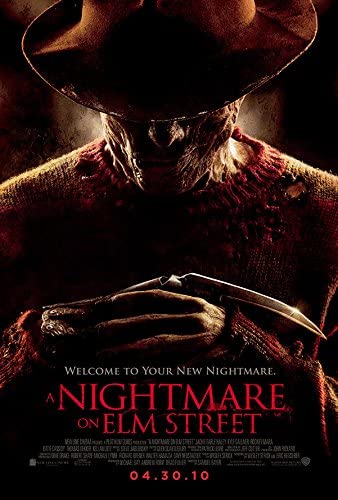
Typography, even though it’s usually the last element to be looked at, is very crucial in movie poster design. The title design is basically the logo of the film and sets the tone for the kind of film you are supposed to expect by communicating a vibe and evoke some kind of emotion to the audience (Bakshi). In fact, each genre has their own typeface styles that within one look you can tell which genre the film is going to be. Kazunori Uchida, Daisuke Kohara, Maho Yamada, and Kakuro Amasaka, conducted a study that focuses on advertising posters for movies and investigating methods of designing compelling posters to encourage viewing. After conducting the experiment, the results were that three different designs can be used to create captivating and memorable movie posters that uses different design layouts where it is either title-oriented, message-oriented, or cast-oriented (Uchida, et al.). So if the poster is message or title-oriented then the font needs to stand out, be memorable and captivating, and match the poster and with the correct genre. For example, the poster above for the film, A Nightmare on Elm Street, while it has Freddy Krueger front and center and scary looking, the font helps to express the emotion of terror and fear. Since it is a horror movie, they tend to use the same typeface, Trajan, because it is sharp on the edges and it is a thin serif typeface, that with the right color and texture it can make the audience feel terror and fear (PRINT).
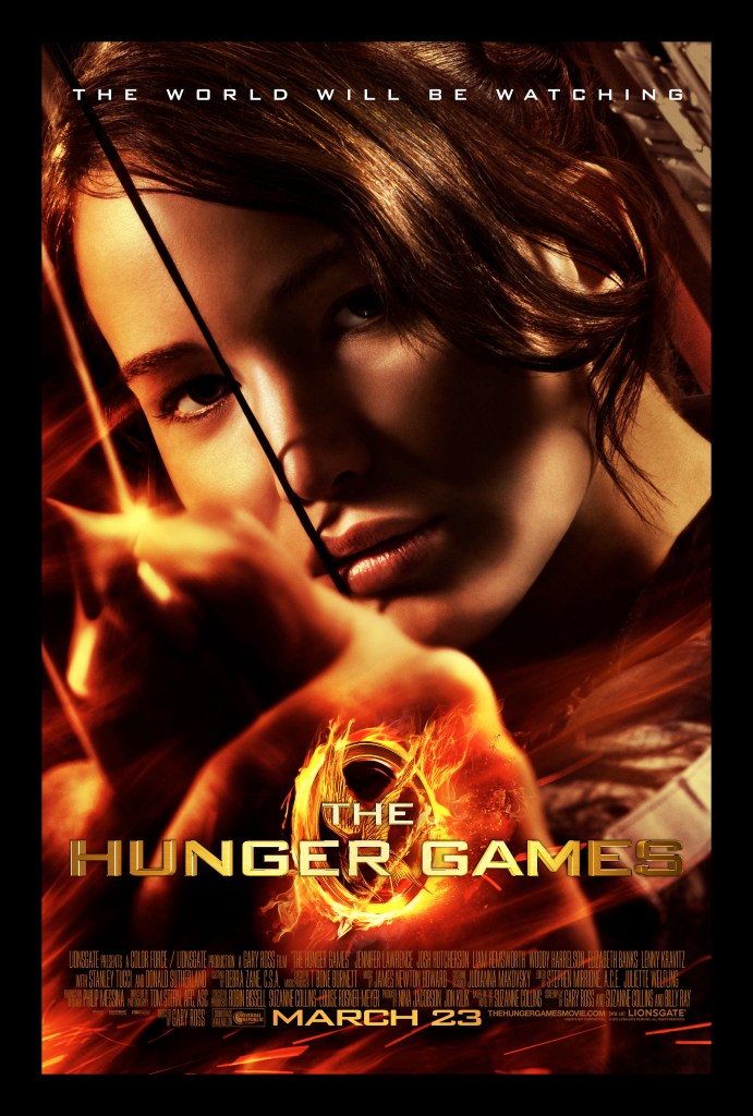
Then with the poster for The Hunger Games, since it’s an action movie it uses the style popular among action movies. These movie posters use sans-serif typefaces (Eurostile and Bank Gothic) with right angles, and depending on the film some textures go with it like metal, stone, fire, or even a grunge texture works (PRINT). In fact the title for The Hunger Games poster uses fire behind it with a metal like texture to match the mockingbird pin that is important in the story. Choosing the right typeface can make all the difference in whether the film will be successful or not. Typographers say that fonts turn words into stories (Arnaud). When it comes to visuals it’s all about the stories people see and the movie posters are no exception. These posters are one of the few things that the audience sees before a film is released and if the typography or the images doesn’t tell some kind of story then it won’t be successful. Lastly, we are constantly trying to find something new to watch on Netflix, and the first thing we see are the posters and the typography right off the bat and if it doesn’t spark any interest then we would skip it and on to the next one. So typography is just as crucial as the colors and images on the rest of the poster.
Conclusion
As shown and mentioned many times, color can express different emotions in order to advertise and promote films. In advertising, it’s very important to evoke the right emotion for the product so people will like and enjoy what they paid for and recommend to others so that in this case the film can be successful. It’s all like one giant puzzle, without one piece you can’t finish it and in this case without the right color, image, or typeface, the movie poster wouldn’t be complete and wouldn’t be successful as it should be. Thus, leading to a flop at the box office for that film. Next time you see a movie poster ask yourself, how does it make me feel?
References
- Hanada, M. Correspondence analysis of color–emotion associations. Color Research and Application. 2018; 43: 224– 237.
- Uchida, Kazunori, et al. “Making Compelling Movie Posters using Statistical Science and an Eye Mark Recorder.”Journal of Business Case Studies (Online), vol. 7, no. 6, 2011, pp. 63-70. ProQuest
- Singh, Nayanika, and S. K. Srivastava. “Impact of Colors on the Psychology of Marketing — A Comprehensive over View.” Management and Labour Studies, vol. 36, no. 2, May 2011, pp. 199–209
- Rufí, José P. P. “El Cartel De Cine hoy/The Movie Poster Now.” Pensar La Publicidad, vol. 4, no. 2, 2010, pp. 71-88. ProQuest
- Losowsky, Andrew. “Introduction.” Visual Storytelling, pp. 4–7. (1)
- Busche, Laura. “Simplicity, Symmetry and More: Gestalt Theory and the Design Principles It Gave Birth To.” Design Elements and Principles, http://www.canva.com/learn/gestalt-theory/. (2)
- McLeod, Saul “Visual Perception Theory.” Simply Psychology, 2018, http://www.simplypsychology.org/perception-theories.html. (2)
- “Putting Some Emotion into Your Design – Plutchik’s Wheel of Emotions.” The Interaction Design Foundation, Aug. 2020, http://www.interaction-design.org/literature/article/putting-some-emotion-into-your-design-plutchik-s-wheel-of-emotions. (2)
- Norman, Donald A., and Andrew Ortony. Designers and Users: Two Perspectives on Emotion and Design. projectsfinal.interactionivrea.org/2004-2005/SYMPOSIUM 2005/communication material/DESIGNERS AND USERS_Norman.pdf. (2)
- Ted Talk. “The Stories Behind The New Yorker’s Iconic Covers | Françoise Mouly.” YouTube, 17 Aug. 2017, http://www.youtube.com/watch?v=2vE-elqTGlQ. (4)
- Zen, Pola. “5 Storytelling Secrets to Improve Your Visual Marketing Images.” Yotpo, 3 Feb. 2020, http://www.yotpo.com/blog/5-visual-storytelling-secrets-to-improve-your-marketing-images/. (5)
- Arnaud, Jourdan. “Make Your Typography Stand Out.” The Los Angeles Film School, 22 Apr. 2020, http://www.lafilm.edu/blog/make-your-typography-stand-out/.
- Van Winkel, Rafael. “Building on Typography Trends in Movie Poster Design.” PRINT, PRINT, 16 Sept. 2020, http://www.printmag.com/post/typography-movie-poster-design.
- Bakshi, Jahan Singh. “Posterphilia: What Makes A Great Movie Poster?” Film Companion, 18 Nov. 2018, http://www.filmcompanion.in/posterphilia/posterphilia-what-makes-a-great-movie-poster/.
- Vanity Fair. “Movie Poster Expert Explains Color Schemes | Vanity Fair.” YouTube, 11 Mar. 2019, http://www.youtube.com/watch?v=BEbW2fXSShc.
Images:
- Velarde, Orana. “45 Redesigned Movie Posters to Inspire Your Creativity.” Visual Learning Center by Visme, visme.co/blog/minimalist-movie-posters/.
- “The Classic Film Posters of Saul Bass – in Pictures.” The Guardian, Guardian News and Media, 13 Aug. 2016, https://www.theguardian.com/film/gallery/2016/aug/13/saul-bass-classic-film-posters-photos.
- La Boca. “Black Swan.” Black Swan – La Boca, 2010, site.laboca.co.uk/Black-Swan.
- “Blue and Orange Movie Posters.” Pinterest, http://www.pinterest.com/pin/415175659398581391/.
- “A Nightmare on Elm Street.” IMDb, IMDb.com, 30 Apr. 2010, http://www.imdb.com/title/tt1179056/.
- “Putting Some Emotion into Your Design – Plutchik’s Wheel of Emotions.” The Interaction Design Foundation, Aug. 2020, http://www.interaction-design.org/literature/article/putting-some-emotion-into-your-design-plutchik-s-wheel-of-emotions.
- “The Jungle Book.” IMDb, IMDb.com, 7 Apr. 2016, http://www.imdb.com/title/tt3040964/.
- “It.” IMDb, IMDb.com, 6 Sept. 2017, http://www.imdb.com/title/tt1396484/?ref_=fn_al_tt_1.
- “Graphic Design: Insights into Creating Movie Posters.” Icons8 Blog, 7 Sept. 2020, icons8.com/articles/graphic-design-movie-posters/.
- Jake. “The Theory of Everything.” JAKE’S MOVIE STUFF, http://www.jakesmoviestuff.com/the-theory-of-everything-review.html.
- “The Bourne Ultimatum.” IMDb, IMDb.com, 3 Aug. 2007, http://www.imdb.com/title/tt0440963/?ref_=nv_sr_srsg_0.
- “Central Intelligence.” IMDb, IMDb.com, 15 June 2016, http://www.imdb.com/title/tt1489889/?ref_=nv_sr_srsg_0.
- “The Hustle.” IMDb, IMDb.com, 8 May 2019, http://www.imdb.com/title/tt1298644/?ref_=nv_sr_srsg_0.
- “The Help.” IMDb, IMDb.com, 10 Aug. 2011, http://www.imdb.com/title/tt1454029/?ref_=nv_sr_srsg_0.
- “The Proposal.” IMDb, IMDb.com, 17 June 2009, http://www.imdb.com/title/tt1041829/?ref_=nv_sr_srsg_0.
- “The Spy Next Door.” IMDb, IMDb.com, 15 Jan. 2010, http://www.imdb.com/title/tt1273678/?ref_=nv_sr_srsg_0.
- “Us.” IMDb, IMDb.com, 20 Mar. 2019, http://www.imdb.com/title/tt6857112/?ref_=nv_sr_srsg_4.
- “Annabelle Comes Home.” IMDb, IMDb.com, 21 June 2019, http://www.imdb.com/title/tt8350360/?ref_=nv_sr_srsg_0.
- Barsamian, Edward. “The Ocean’s 8 Trailer Is Here, and It’s Awesome.” Vogue, Vogue, 19 Dec. 2017, http://www.vogue.com/article/oceans-8-trailer-sandra-bullock-cate-blanchett-rihanna-june-2018.
- “POSTER Movie Film Movies Posters.” WallpaperUP, 12 Dec. 2015, http://www.wallpaperup.com/858387/POSTER_movie_film_movies_posters.html.
