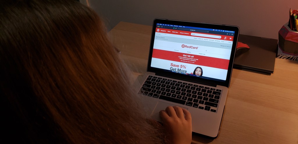
Taking on the task to redesign or just to design anything, whether it is a new product, a newer model of an existing product, an update of some kind, or even a redesign of a website, can be difficult without the proper tools and methods. To some people it may seem like an easy task to accomplish, however, there is so much more that goes into a redesign than most people realize which is why it takes a long time for a new update or product to come out.
Accepting the task of redesigning Target’s website was not easy, but many surprises and new insights came up throughout the process. Target is so well known by basically everyone on the planet and its website is no different. So trying to redesign something that is so well known can be tricky because the user should still be able to recognize it when it is done and be able to shop on it as easily as they have done it in the past or maybe even easier. The first question is where to begin?
The Research
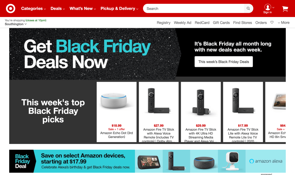
Before jumping into the deep end, the first step is always to research whatever it is that is being redesigned and in this case it is Target.com. Looking into the history of Target, what the site looks like at the present moment, and even starting to notice the problem areas and where improvements can be made can help have a starting point. The first impressions are very important when it is a company website because they are not able to stand next to the user and help them through any problems that come up as the users are navigating around the site. They also need to be able to capture the users attention and make them want to use the website more in under five seconds or else they will automatically go somewhere else that is more to their liking and speed.
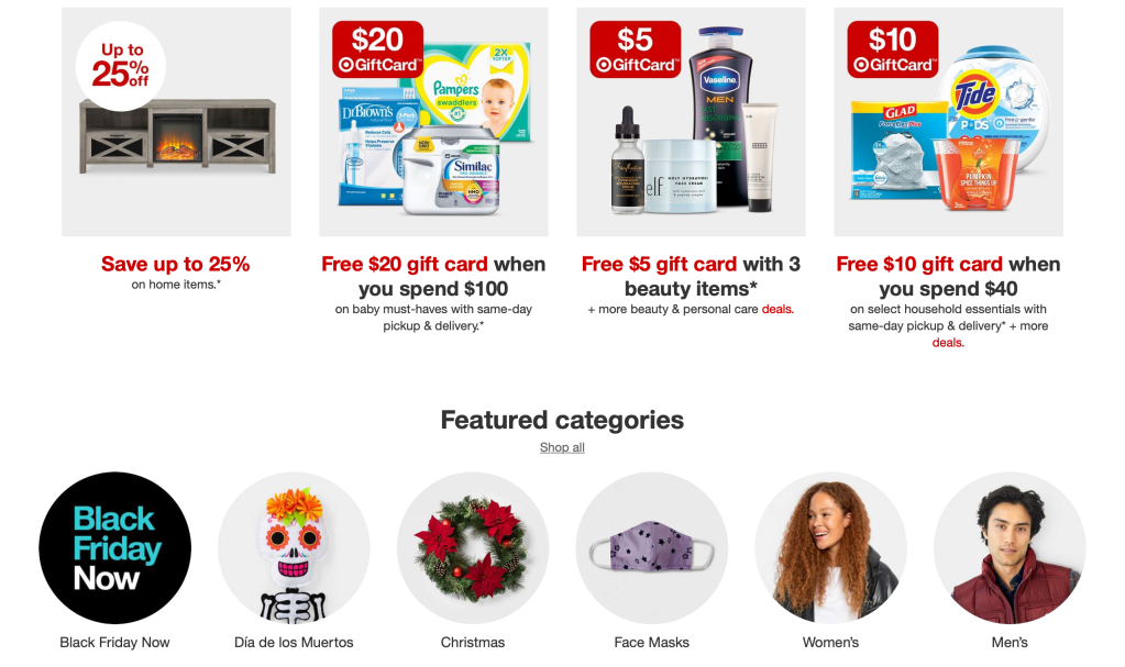
So right away there were many improvements that can be made to Target’s website. The problems that quickly came up was that there was a lot of clutter on the home page even though it was separated by images, there was no need for two separate navigation bars at the top, there were too many categories for a user to sift through, some information is either hidden or is not clearly stated for the user, and it takes too long to complete tasks that should be done with one or two clicks.
Looking at Target’s Competitors
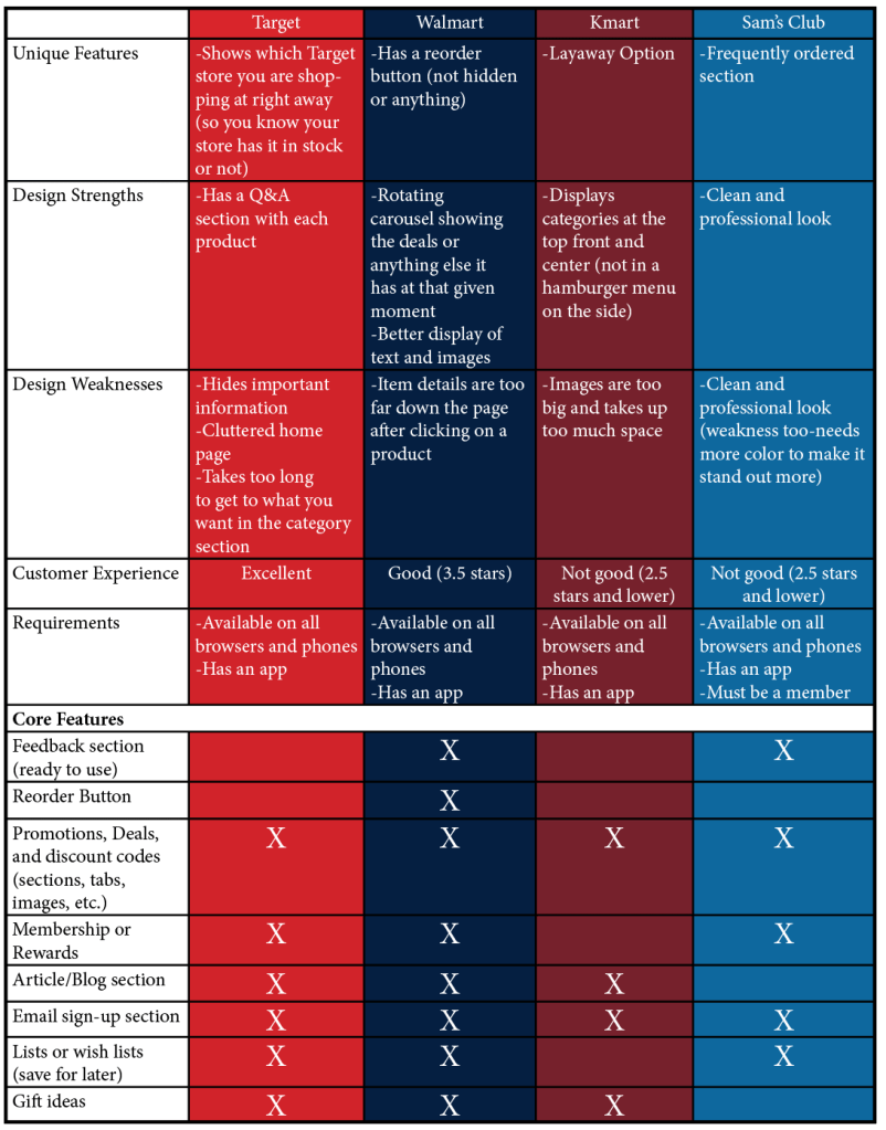
Once the site has been thoroughly analyzed and dissected, the next step is to compare Target’s website against similar sites, like in this case it was Walmart, Kmart, and Sam’s Club. A competitors analysis is done where everything is looked at including the unique features each site has, their design strengths and weaknesses, the customer experience, and any core features that each site does or does not have. After this table has been created some features or strengths that are really working and are great to have on a different site may prove to be helpful on Target’s site and improve the site overall. You never know what can come up that either surprises you or that you never would have thought about but will make the site that much better even if it’s just a little bit it’s still better than it has been.
Knowing the Users
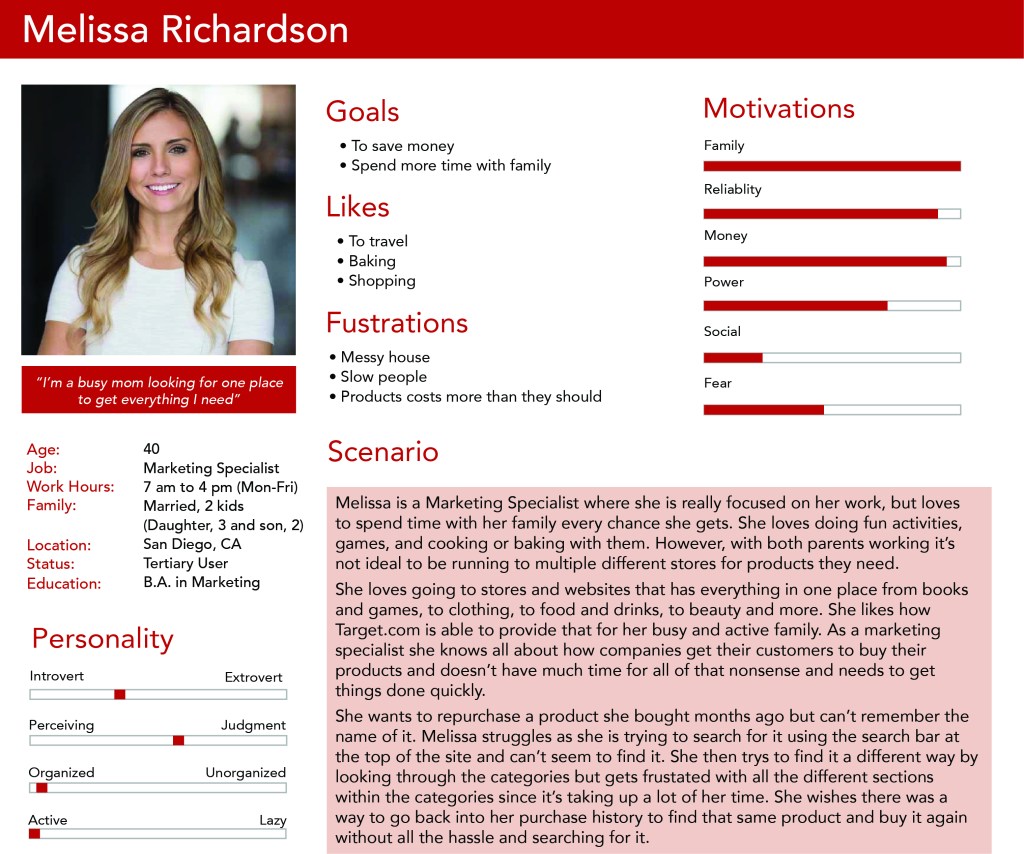
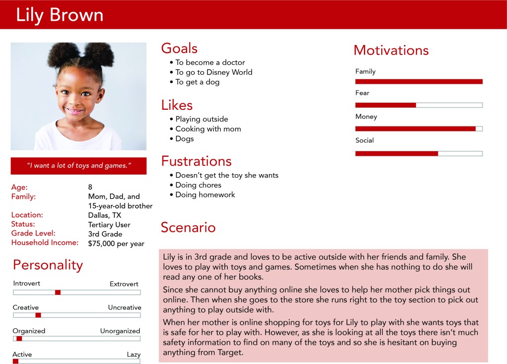
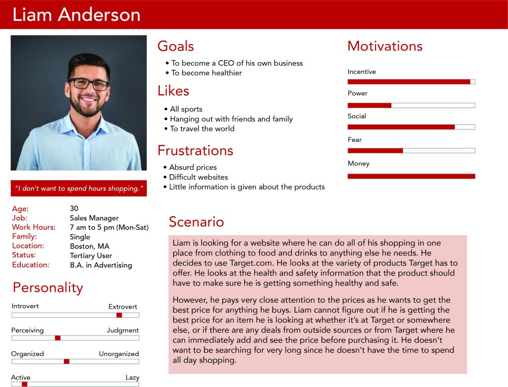
Personas give an insight into who the users are that are using Target’s site and who are either returning or potential new users. These personas help to create realistic representations of these users by providing their backgrounds, goals, and even values as well as providing what they need and expect as they are shopping online. They aid in determining what should and shouldn’t stay on the site and if there is anything that should be added that hasn’t been thought of before. Creating personas with people of different ages help to determine how to attract different age groups to the site and in the best way possible.
Conducting Interviews and Surveys
Now there are interviews and surveys that happen where the company is able to gain helpful information and insight into how the users truly feel about the website. The interviews is obviously the more in-depth and longer method than the survey since the interviewer is able to talk directly to the participant and questions can come up that never would have been thought of before or in a survey. The survey part of the redesign is meant to be shorter since people nowadays don’t have as much time or the attention span to write long responses or to fill out something with a lot of questions. With surveys the company is able to get a large number of responses because people are able to participate in them from where ever they are most comfortable compared to an interview where the participant has to take time out of their busy life and go somewhere for the interview.
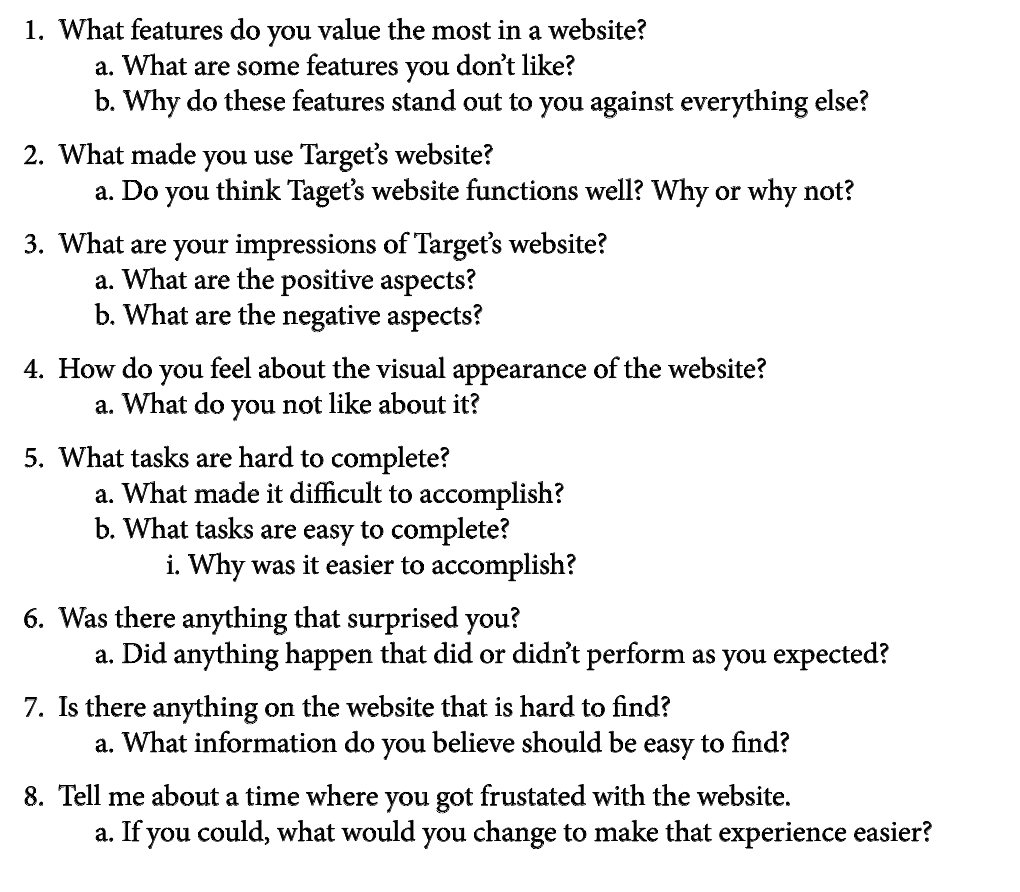
Some of the interview questions 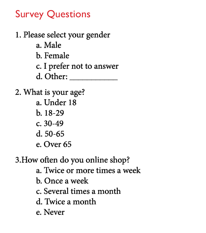
Some of the survey questions 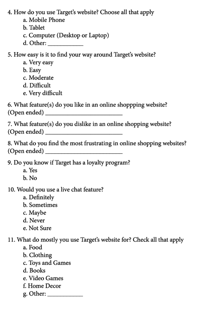
Some of the survey questions (cont.)
How the Users Think
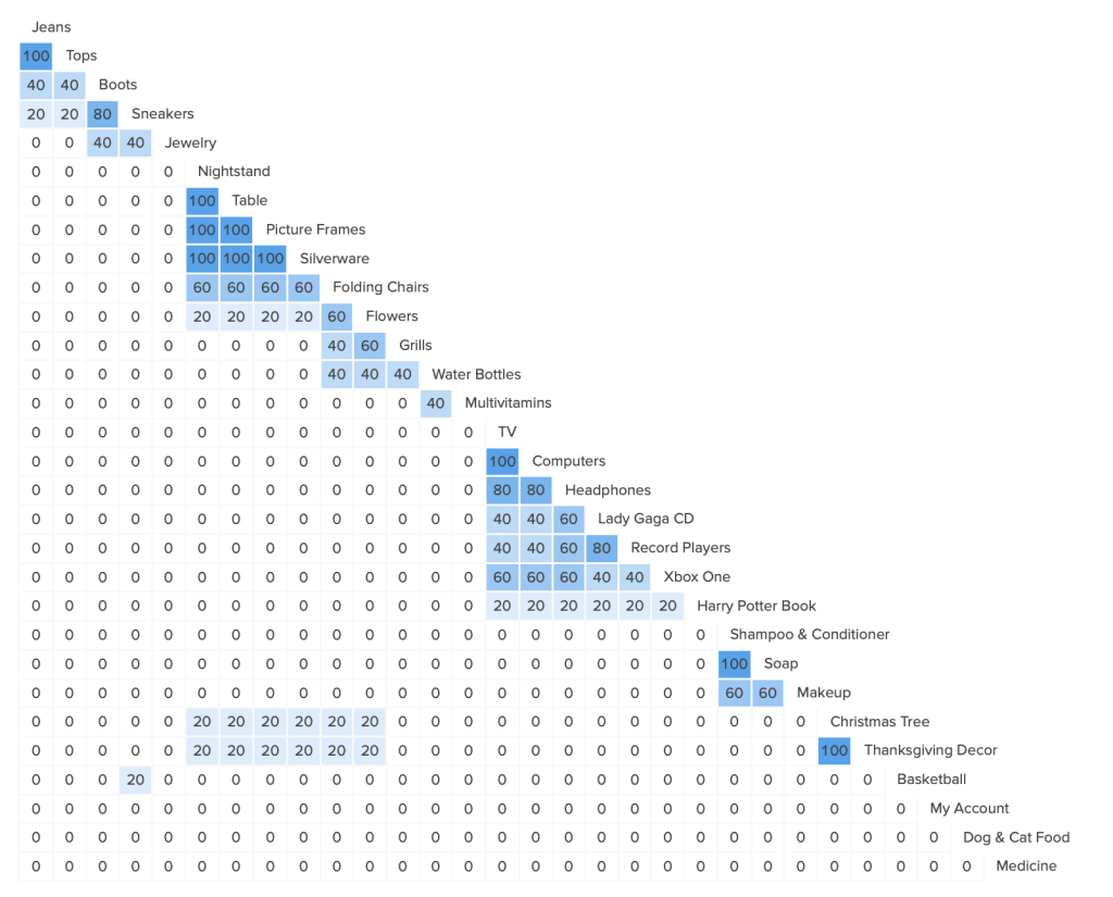
Card sorting is a very useful method as it helps to determine what categories to keep and what to get rid of. This allows the user to show how they use the site and where different sections of the site should be located. Using this method you are able to have predetermined categories, no categories in that the participant uses categories that they come up with, or have both predetermined categories and ones that the participant comes up with.
After conducting a card sorting experiment where the five participants had predetermined categories as well as the option to make their own, the results were as expected. Some of the categories where left in as part of the ones the participant can choose, while others were left off in order to see how the participants will react and organize it all. In fact, the participants put similar products together and stated that there was many that can be under one larger category in order to have less categories overall. For example, there can be one larger category called “Clothing” that includes the other categories “Mens”, “Womens”, “Kids”, and “Babies”, and the larger category “Entertainment” includes “Music”, “Books”, “Music”, and “Video Games”. This resulted in having a dramatic decrease in the amount of categories that was actually needed, from 30 categories down to 12. This ultimately will make it easier for the users to find out where to find certain products instead of guessing which one of three different categories it can possibly be under.
Conducting a Study and Evaluation
A diary study and the heuristic evaluation are not the methods that are really known by many. The diary study can gather data that is helpful since it’s based on a specified amount of time and not something that someone answers once and that’s it. In this case, the study for the Target website redesign consisted of the participants receiving texts with six questions that they have to answer once a week for two months. This way they don’t have to go anywhere, keep track of a physical book/notebook, and instead can answer them wherever they are when it comes it. Then once it’s completed they will get an incentive ($20 Target gift card) since people are more likely to participate if they get something out of it for taking time out of their day to complete it. Next, the heuristic evaluation allows for someone who isn’t involved with the redesign or the company. This way it can be a fresh pair of eyes and to someone who is possibly a first-time user and they are able to know what works, if anything needs to be improved, and may even find new things to be improved or removed from the site that hasn’t been noticed before.
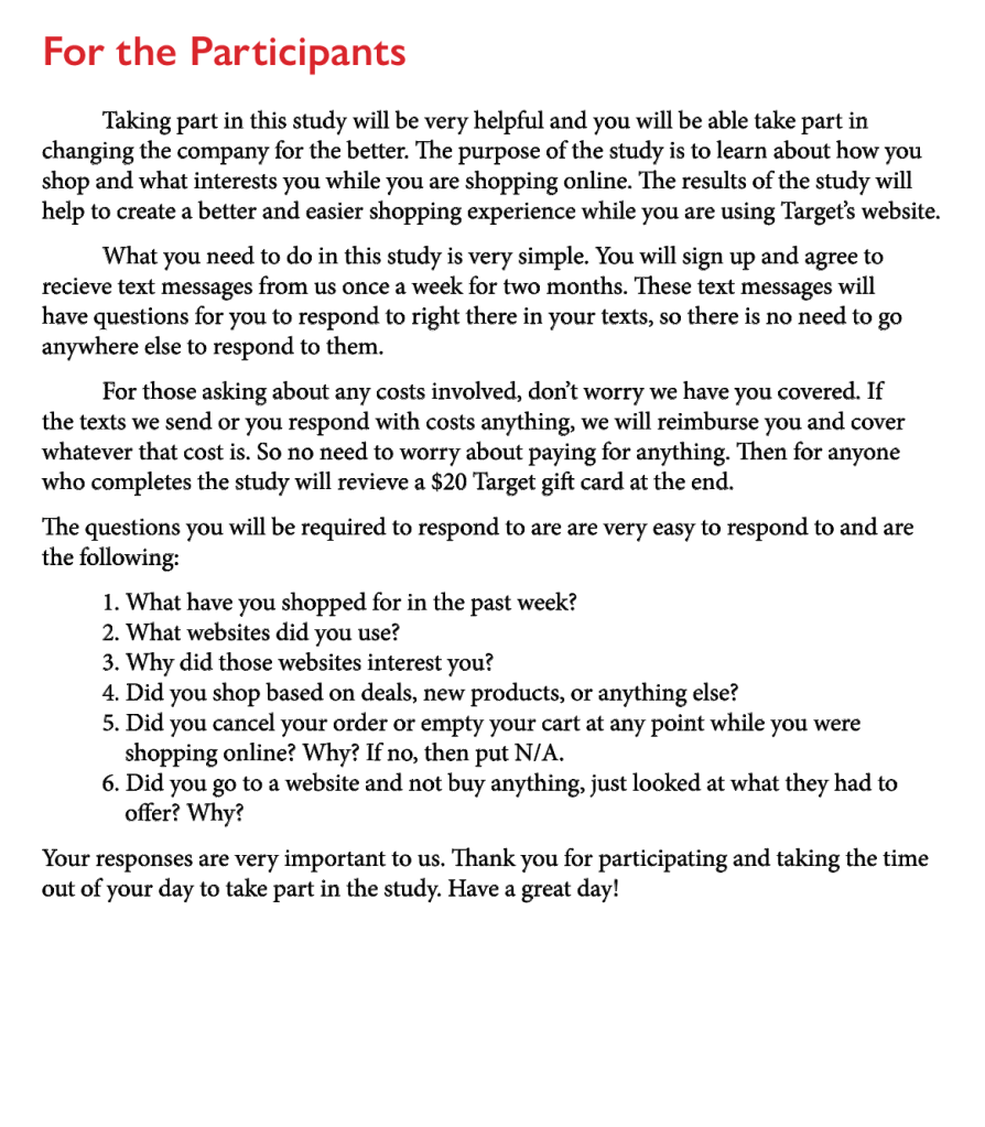
Diary Study 
Heuristic Evaluation 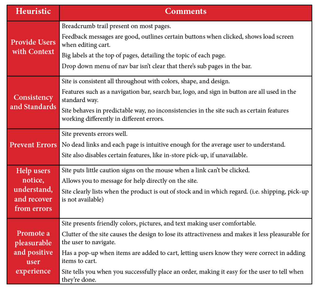
Heuristic Evaluation (cont.)
Conducting a Usability Test
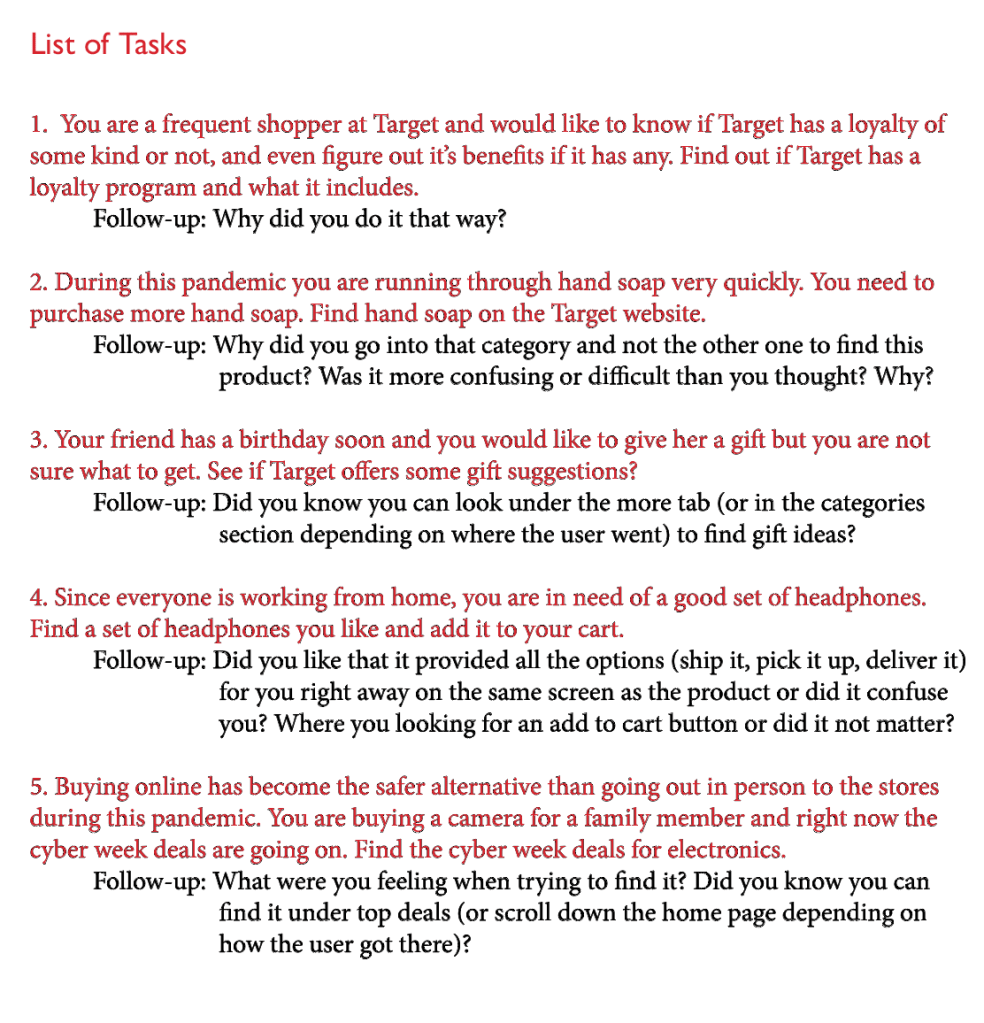
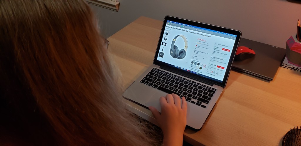
Having a usability test in this redesign of Target’s website was very eye opening in that at times the results were very surprising and some were expected. This kind of testing allows those who are performing the testing to see first-hand how the user uses the website and how they are able to find the things they need. Three participants were given the same five tasks and they had to perform those tasks without any help but still saying their thoughts and feelings aloud. Some of these tasks may seem easy for many people however there are many people who would struggle with it and it was important to see if any did. Once this test was done, the results were that there was a need to clearly say “Loyalty Program” somewhere on the site since no one knew where and what it was, narrow down the categories, get rid of any unused space, bring back the “Add to Cart” button and move the three options (pick it up, deliver it, and ship it) to later in the checkout process, and then to be able to get to a desired location as quicker.
Conclusion
Overall, while the redesign of Target’s website was very long and difficult at times, it was eye opening in that you never know what ideas can appear and what a participant will say or do that can bring the redesign to a whole other level. All of the different steps and methods that were used along the way was very necessary in creating a redesign that would be very successful and will make the users of Target’s website very happy in that their online shopping experience was smoother, easier, and quicker.
Check out the full PDF of the redesign of Target’s website below.
