What is the difference between medium fidelity and high fidelity prototypes?
In a previous blog post, I discussed how I created a low-fidelity prototype of my for the town of Southington, CT. This type of prototype did not pay any attention to details and instead focused more on getting my ideas out on paper with just enough to make sense of what it could possibly look like once I start to refine it all and make creative decisions.
Now, on the other hand, there are medium fidelity and high fidelity prototypes as well. These take on more details and to the point where it could really be an actual app on everyone’s phones. The medium-fidelity allows for the designer to focus more on the functionality and experience the app will give to the user rather than focusing on images and videos. They do, however, still leave space for those aspects of the app by having a rectangle with an ‘X’ to let others know that a video or image or some kind of graphic goes there. It also does not do much with color.
High fidelity, in contrast to low fidelity and medium-fidelity, is the most thought-out version of a design and prototype. This type allows and requires color, images, videos, graphics, and even icons to work in harmony so the app can function properly and give the user the best experience possible. There is so much detail in this kind of prototype that when users are testing it out, they can really feel like it is an app that they always had on their phones.
Creating the Final Prototype
My final prototype was created using Invision Studio and is what I would consider to be a mixture of medium-fidelity and high fidelity prototypes. For the most part, everything is high fidelity. The only part I decided to leave out were the actual pictures, and instead showed that as a rectangle with an ‘X’ through it.
Color
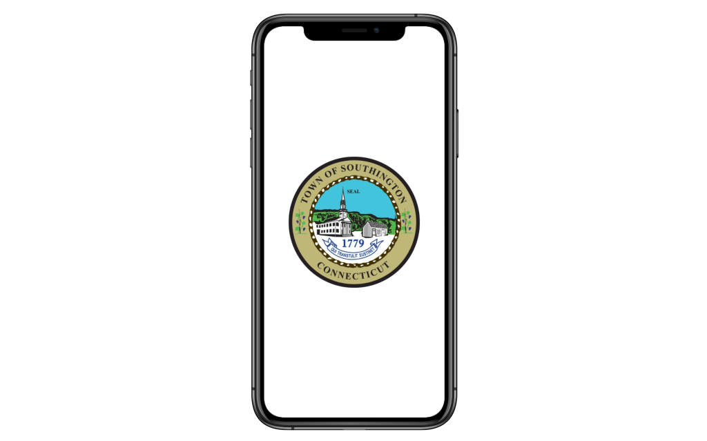
I try to have a final decision on anything I can so that I can spend more time in other parts of the app that really needs it, and this includes color. Usually, people may leave color closer to the end and focus more on the rest of the app. Right away I knew I wanted to keep it very simple with a three-color limit and use a color that Southington would be known for, and that would be blue. In fact, I decided to use the blue that is in the seal or logo of Southington which was a perfect shade that was not too distracting or annoying for the users. The blue I chose can actually be calming for many people. From there I stuck with black and white along with a different tint of the same blue. The different tint of the blue is lighter and is used where the user would have to type something in it.
Icons
From there it was time to put the pieces together. I gave the users options, but not too many just the right amount, to navigate around the app easier. It starts at the top of every screen. There is the logo that, if tapped or clicked on, would bring the user back to the home screen, which is universally known when there is a logo at the top of a screen. Then there is a magnifying glass to represent the search icon and the three rectangles or lines stack on top of each other is a hamburger menu that can lead the user to other screens and parts of the app.
Like the hamburger menu, the bottom navigation does the same thing but can prove to be easier for the user instead of the hamburger menu every time. The four icons in the bottom navigation include (from left to right):
- A house – brings users back to the home screen (house = home)
- Two people – brings users to the residents screen (residents = people)
- Tall building – brings users to the businesses screen (tall building = tall office building)
- Column building – brings users to the government screen (looks like the buildings in Washington D.C. = government)
Listening to the feedback from many people they felt like having one person is too close to a profile icon that many apps use today, and the gavel I had in the low fidelity prototype represented judicial and not really the government to many people. This is why I added a second person to represent more than one resident and changed the gavel to the column building after many people connected it with the government more than the gavel. Also, whenever one of the icons in the bottom navigation is filled in white, then that’s how the user knows the section of the app the user is in and to keep track of where they are.
Paper to Digital Prototype
For the most part, I created digital versions of the paper prototype that I created with improvements and I was able to expand and add more screens after realizing pieces were missing or can be broken up into multiple screens to keep it easier on the users. For example, the sign-up form for the volunteer opportunity was changed up and parts were added including a section for permission and emergency medical information.
Once the all the design work was finished I was able to make it interactive which got confusing after a little bit with arrows going every which way and making sure everything that needed to be interactive was just that. After a while it was easier and I was able to create a working prototype for the app.
Southington App Walkthrough
The video is a detailed walkthrough of the app I created where I am able to explain the decisions I made and why as well as what made me go in one direction over the other.
Conclusion
All in all, my app may seem like it’s minimalistic, however, it’s simple to not overwhelm the users but to put them at ease throughout the app. The design, even though it’s simple, allows for the app to function very well and the users can have a great experience with it.
Prototype Link to try it yourself: https://projects.invisionapp.com/prototype/Southington-App-cko4lz80o001vrr01gnrf5vpi/play/8539b7cb
Below is the PDF of the entire project:
