For many, many years the world has been divided about an issue that is severely hurting the planet, climate change. One side claims that scientists are making it up and it’s all fake. While the other side is arguing that humans have created a devastating impact on the planet and without changing and helping the planet, billions of species will become extinct and the world’s population can also rapidly decline. This can include anything from the pollution in the air and sea, rising temperatures, rising and warming of the sea, loss of species (land and sea), and so much more.
Scientists have releasing data to the public for many years, however, it hasn’t made as much of an impact as it should because it is mostly just words. Today’s society is reading a lot less and looking at visuals whether it is a still picture of some kind or even a video or motion graphic, due to the attention spans being so short. People actually skip over the readings if there are visuals involved which is why people spend more time on them so it can make the same impact as the writing. Fabiola Cristina Rodríguez Estrada and Lloyd Spencer Davis states that “We live in an environment shaped by images, which surround us all the time, telling us how to think, feel, and talk”. To this end, images can greatly influence the way we see the world. Those who have created well-designed images about climate change can really help people understand the impact they are making and help save the planet.
Artists of all types have come in and created visuals to help make sense of all the data surrounding climate change. This can be a photograph, infographic, an interactive image, or anything else that they can come with that will allow the viewers to be engaged with it and be captivated or at least interested in it. However, the viewer should not be overloaded with visuals, text, or anything that is unnecessary. Bill Dennison even states “The process of reducing extraneous information in the visual elements (e.g., ‘chart junk’, ‘map junk’) allows the viewer to focus on the content of interest”. By doing this the viewer will have retained more information and the visual may have impacted them in the way the designer had hoped.
The visuals below are all different in that the information about climate change has been used to create different types of visuals that are captivating and impactful for the viewer that is not just a simple graph.
- CLIMATE CHANGE INFOGRAPHIC
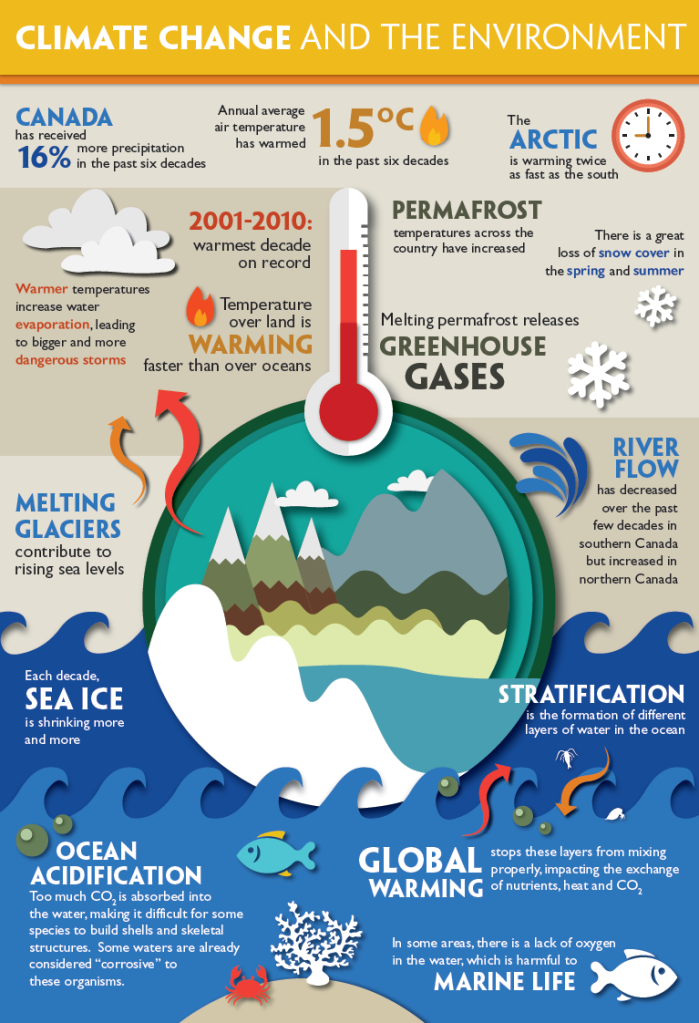
Infographics have become a lot more popular when people are trying to understand any information. It’s able to combine visuals and text to create a lasting impact on the viewer. Since we are overwhelmed by numerous visuals 24/7, 365 days a year, it’s no wonder that people today are looking at visuals a lot more than actual text unless they absolutely need to. Here, to help someone learn about climate change, the designer created an infographic with different visuals and icons to represent different aspects that are affected by climate change. The entire piece is very captivating for the viewer with the colors and icons, and the way it’s set up with the top half being the land and air and the bottom half being about the sea and marine life.
2. PHOTOJOURNALISM

Taking photos using whatever the person has whether it’s a camera or a phone, allows the person to tell a story within one or several photos. If the photo is really successful then it can impact the audience’s feelings to make them feel a certain way. This photo that captured a polar bear not on ice, but rather in a place where humans usually are, creates the feeling of apprehension with the audience since they may think that something bad will happen to it because it’s not where it should be and is very skinny and unhealthy looking as well as sadness and anger that the animal is in that condition. Robert Plutchik created a wheel of emotions where there are different intensities for the eight primary emotions, so for example, apprehension is the least intense for the emotion of fear. Françoise Mouly states in her Ted Talk, “The Stories Behind The New Yorker’s Iconic Covers” that “…the images don’t just have to show people, sometimes it can be a feeling.” In this case the very skinny polar bear isn’t where it belongs and is looking so anything to eat, along with the environment and lighting allows the audience to feel something towards the image but also towards climate change because it caused the polar bear to be in the situation it’s in with the ice melting so quick (so no home) and the food disappearing.
3. INTERACTIVE PHOTO

Having data be presented in an interactive photo allows the viewer to be engaged with it and by doing so they are able to retain more of what they are reading about allowing the visual to be impactful and helpful. In the article titled, Scientific Storytelling using Visualization, it states, “By actively participating in the process of visualization, viewers will feel a greater sense of engagement with the data being presented”. In this case, the website allows the viewer to choose how climate change has impacted the world by selecting what is being impacted or getting impacted like the sea levels, sea ice, carbon emissions, or the average global temperature. From here they can move between two points to see what happens when climate change happens. In this photo for example, the viewer can see how much the temperature has changed and risen from 1884 to 2019. In today’s society, many people need to be doing something at all times and can’t sit still, so by having something that’s interactive and can allow them learn about climate change and understand what they are reading when they can’t just sit and read. For the most part, it’s not only engaging, but it’s much more impactful than the text itself. It also presents the information as explorative analysis that allows the viewer to see were relationships in data may exist (Interaction Design Foundation). In this case, the relationship is the geography and the temperature.
4. A DIFFERENT KIND OF GRAPH

There are tons of graphs out there now; line graphs, bar graphs, scatterplots, and more. However, many people skip past them because they don’t capture their attention and many can be confusing to figure out and read. People don’t have enough attention span to try to figure it out or analyze them like they used to in the past due to the fact that there are so many visuals for people to look at that are more intriguing. The artist that created this started at the center which is 0 degrees Celsius and each loop around is one year. Color can add a lot to the story within the visual. In this case it started out in the cooler colors of blue, purple and green, and as it got closer to 1.5 degrees Celsius it changed over to the warmer colors, further emphasizing that global warming is happening and at this rate the world will only get warmer and warmer unless people make a difference. Having the background be black makes the rest of it stand out against other visuals, and the rings showing 1.5 degrees Celsius and 2.0 degrees Celsius are red to represent danger and allowing the viewers to feel something towards the visual as it does represent the temperature increasing at an alarming rate.
5. TEMPERATURE STRIPES

The warming stripes that is shown here, shows two different paths that the world can go. The blue stripes shows when the world’s temperature was normal and then as it continues the stripes become red and in one path it gets darker and darker while in the other path it becomes lighter like it’s going backwards to normal when it wasn’t that much of a problem yet. The fact that it tells the viewer exactly where the world is at this point (as of 2019), and that it’s on the top row where it just gets darker and darker can instill emotions like fear into the viewers since it shows that the path the world is on right now isn’t a good one. Usually whenever we see something get darker whether it’s a movie or a still image it never means something good is going to happen, and this is no different. Global warming is real and it has been happening for many years as it is clearly shown in this visual and it’s up to us to change the path we are on to save the planet and our future.
Visuals like these are appearing more and more in hopes for people to understand science without needing to read countless pages of data and research that they don’t understand. Especially with climate change being an extremely important issue right now throughout the entire world, it allows designers to create captivating and rememberable visuals that lets the viewers understand this issue in hopes to change their futures for the better. After all, there is no Planet B.
RESOURCES:
Images:
- “The Best of 2019 Wildlife Photography Awards – in Pictures.” The Guardian, Guardian News and Media, 1 Jan. 2020, http://www.theguardian.com/environment/gallery/2020/jan/01/the-best-of-2019-wildlife-photography-awards-in-pictures.
- “Climate Change.” Let’s Talk Energy – Climate Change Adaptation Lesson Plans and Infographics, energy.techno-science.ca/en/resources/climate-change-lesson-plans.php?fbclid=IwAR1M6eXQUEfOgQMxCSsftsEQNbghUmmV9rhdS1CQoADKTKTThr-aZSb2puQ.
- Hawkins, Ed. “Spiralling Global Temperatures.” Climate Lab Book, 9 May 2016, http://www.climate-lab-book.ac.uk/2016/spiralling-global-temperatures/.
- “Interactive: Climate Time Machine – Climate Change: Vital Signs of the Planet.” NASA, NASA, 14 June 2017, climate.nasa.gov/climate_resources/25/interactive-climate-time-machine/.
- Kahn, Brian. “New Climate Change Visualization Presents Two Stark Choices For Our Future.” Earther, Earther, 20 Mar. 2019, earther.gizmodo.com/new-climate-change-visualization-presents-two-stark-cho-1833443663.
Websites:
- “Information Visualization – A Brief Introduction.” The Interaction Design Foundation, Aug. 2020, http://www.interaction-design.org/literature/article/information-visualization-a-brief-introduction.
- Jones, Adrian. “Practical Visual Literacy for Science Communication.” Practical Visual Literacy for Science Communication ” IAN/EcoCheck Blog, 28 Mar. 2017, ian.umces.edu/blog/2017/03/28/practical-visual-literacy-for-science-communication/.
- Ma, Kwan-Liu, et al. Scientific Storytelling Using Visualization. vis.cs.ucdavis.edu/papers/Scientific_Storytelling_CGA.pdf.
- “Putting Some Emotion into Your Design – Plutchik’s Wheel of Emotions.” The Interaction Design Foundation, Aug. 2020, http://www.interaction-design.org/literature/article/putting-some-emotion-into-your-design-plutchik-s-wheel-of-emotions.
- Rodríguez Estrada, Fabiola Cristina, and Lloyd Spencer Davis. Improving Visual Communication of Science Through the Incorporation of Graphic Design Theories and Practices Into Science Communication. 2015, learn-us-east-1-prod-fleet01-xythos.s3.amazonaws.com/5df1cdd432f98/3153766?response-cache-control=private%2C%20max-age%3D21600&response-content-disposition=inline%3B%20filename%2A%3DUTF-8%27%271075547014562914.pdf&response-content-type=application%2Fpdf&X-Amz-Algorithm=AWS4-HMAC-SHA256&X-Amz-Date=20201003T030000Z&X-Amz-SignedHeaders=host&X-Amz-Expires=21600&X-Amz-Credential=AKIAZH6WM4PL5SJBSTP6%2F20201003%2Fus-east-1%2Fs3%2Faws4_request&X-Amz-Signature=ff4976bc8f2e570179f313102c5b56e54bfee7075e95289ea027afb830458b1c.
- Ted Talk. “The Stories Behind The New Yorker’s Iconic Covers | Françoise Mouly.” YouTube, 17 Aug. 2017, http://www.youtube.com/watch?v=2vE-elqTGlQ.
