
How many times has a survey popped up on a website that you were using at the time? How often do you get annoyed when they take too long to complete? Nowadays, companies are trying to get customer and user feedback in any way they can. This can be anywhere from asking questions at checkout in the store, to on the phone during a conversation, and now through pop ups or at the end of an online order through the company’s website. It is like no matter where we look someone is always wanting some kind of feedback.
Usually the response is unsatisfactory because not many people have the time to give the proper feedback or they just complete the feedback interview, questionnaire, or whatever it may be as quickly as possible without giving it a thoughtful response. Instead, it is a short quick response with no substance to it that the company can really use to improve their services for the next and returning users and customers. However, there is hope to changing this. Since so many people are normally turned away when they see open ended questions, or something that will take hours to complete, there is a different method to use that can not only help the company, but can also attract the customers and users to the questionnaire and make them want to complete it. This method is called the system usability scale or SUS as it is sometimes known as. It can look differently depending on where it is being completed whether it is on a laptop or desktop, a phone, or on a hardcopy.

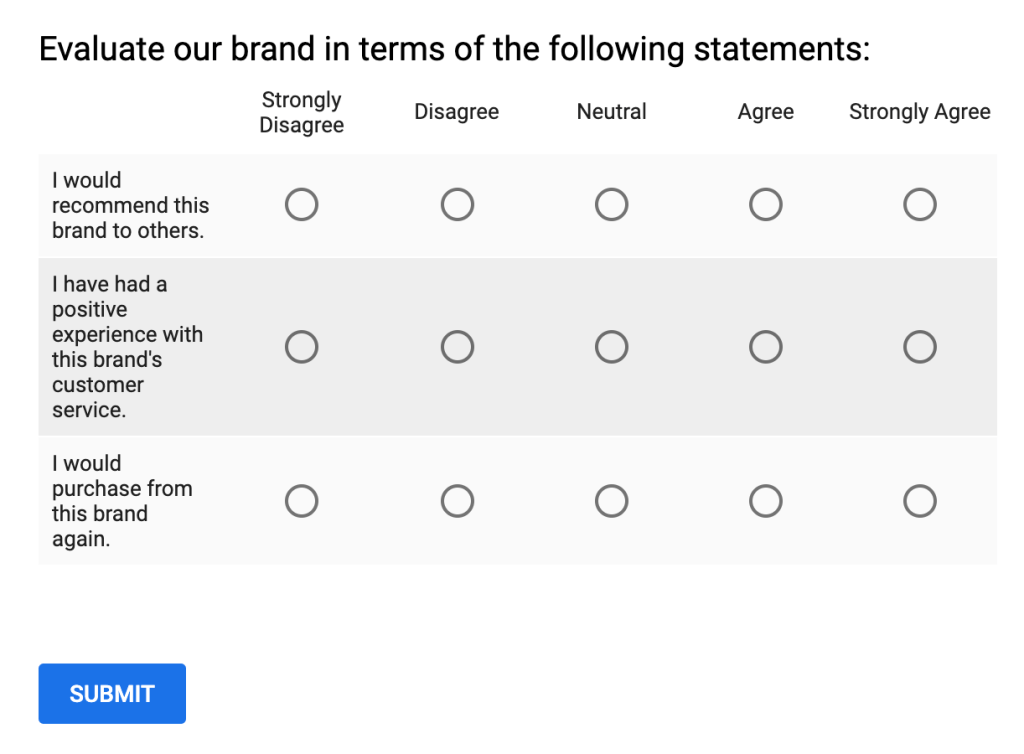
This method can use different scales that ultimately yields the same results. When it appears on a screen or on paper depending on where it shows up, always has questions on one side or on the top and then next to or under each question is a scale. The amount of questions rarely ever changes depending on what the company is looking for, but 10 is the most that this method uses. This scale can either be numbered one through five or has five spaces. Then the number one or the first space means that the user strongly disagrees with the question, while the number five or space five being that you strongly agree with the question.
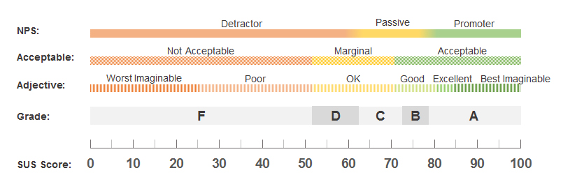
Once the user completes the questionnaire, it then gets added up and given a SUS score similar what we get in school. A score between 0 and 50 is an F or poor, the worst imaginable, and unacceptable, and then 80-100 is an A or good, excellent, best imaginable, and acceptable. Then anything in between is okay, but still needs improvements.
In fact, there have been some research studies that has used the system usability scale method to gather data on how the participants felt about whatever it was they were studying. One of the research studies used this method along with feature comparison in order to compare seven different mainstream wearable fitness devices in order to evaluate their usability. The seven devices were the Apple Watch, Samsung Gear S, Fitbit Surge, Jawbone Up3, Mi Band, Huawei Honor B2, and Misfit Shine and included 388 participants. The results of this study was that “A consumer’s SUS rating for a wearable device is related to their personal situation instead of the device brand. Device manufacturers should put more effort into developing innovative functions and improving the usability of their products by integrating more cognitive behavior change techniques,” (JMIR Publications). The results were also impacted in way that had to be accounted for. The users age, gender, where they lived and how long the user used the device, are just some of the factors that altered the results.
Another study was using the SUS method to help libraries create ways for people to locate and find what they are looking for a lot easier from a book to a thesis paper. The Texas Tech University Libraries used SUS to see how Primo, a discovery tool, is liked by the participants. The participants were given seven tasks and then given the SUS to complete that helped to see what to keep and what needs to be improved upon to provide ease to students trying to get their work done.
Using this method during my redesign of Target’s website can prove to be useful in improving the site. Emotion plays a big role when navigating around a site, and can impact our experiences. So by giving the user a 10 question or less questionnaire that has room to choose an in-between answer (like agree or disagree or even neutral) can attract them to the questions. Normally our emotions are mixed or we feel strongly one way or the other, so by giving the option to choose an answer that is similar to how the user will be more likely to answer them truthfully. Similar to the Emoticon Score Method it can also focus on one area with only question depending on what is being studied at any given moment.
RESOURCES:
Amaresan, Swetha. “What Is a Likert Scale? [Examples & Templates].” HubSpot Blog, 21 Aug. 2019, blog.hubspot.com/service/likert-scale.
Klug, Brandy. “An Overview of the System Usability Scale in Library Website and System Usability Testing.” Weave: Journal of Library User Experience, Michigan Publishing, University of Michigan Library, 1 Jan. 2017, doi.org/10.3998/weave.12535642.0001.602.
Liang J, Xian D, Liu X, Fu J, Zhang X, Tang B, Lei J, Usability Study of Mainstream Wearable Fitness Devices: Feature Analysis and System Usability Scale Evaluation JMIR Mhealth Uhealth 2018;6(11):e11066, http://mhealth.jmir.org/2018/11/e11066/
Sauro, Jeff. “5 Ways to Interpret a SUS Score.” MeasuringU, 19 Sept. 2018, measuringu.com/interpret-sus-score/.
Valdespino2, Anastacia. “System Usability Scale (SUS).” Qualaroo Help & Support Center, Feb. 2020, help.qualaroo.com/hc/en-us/articles/360039474571-System-Usability-Scale-SUS-.
