There is always some kind of plan or outline before a project can begin. Whether it is a painting, a building, or even a website and app there is a basic idea of how everything is organized. Without creating a plan, problems will arise and it can cost thousands and valuable time to fix it all. When creating and redesigning a website it is important to create and understand information architecture or a site map before heading right into the actual mockups with colors, images, and actual text. The user experience on a website relies heavily on the information architecture just as much as any other step in the design or redesign process. If it’s unorganized to any length then users will become frustrated with trying to complete what should be a very simple task, and ultimately leave if they cannot complete what they need to in less than five seconds. Let’s not have this happen, and with the help of information architecture, it is proven to have great results in the final product.
What is Information Architecture? Why is it Important?
Understanding information architecture is very crucial to create one that is well-designed and informative. Nick Babich defines information architecture perfectly, “a discipline that focuses on the organization of information within digital products.” The main components involved are the organization, navigation, and search. When it’s done correctly the website will flow smoothly and the user can easily get from point A to point B without putting in any effort.
A website, for example, can easily become very large and overwhelming. However, by creating a site map you can see what the user will eventually see and understand how they will find what they need. You will be able to see if it is not only difficult to find information that should be easily seen and see just how long it will take the user to get to a specific page. The user should easily get to what they want in less than four clicks, any more than that and it has taken too long. The user has more than likely given up and abandoned the site altogether. Abandoning the site is not what should happen at all, and it means that the site was very unhelpful in getting the user to the desired page and information.
Information Architecture for Southington’s Municipal Website

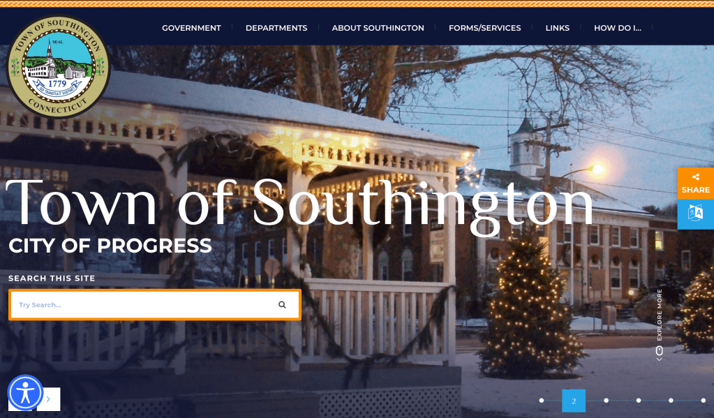
Before I even began creating the site map, I did my research and pretended that I was a user for a little bit on Southington’s municipal website. I clicked through every page, link, button, and looked at any information that was there, while I took notice of the content the pages provided, how long it took to get to different places on the site, and how the site was organized overall. While this took some time, it was well worth it as it was very informative when it came time to create the site map for how it currently is. I didn’t include every single page, link, piece of content, or even external pages because the website is very large and there was no way I would be able to get everything. Instead, I focused on enough to get a good idea of how the site flowed and how it was organized for the users so far.
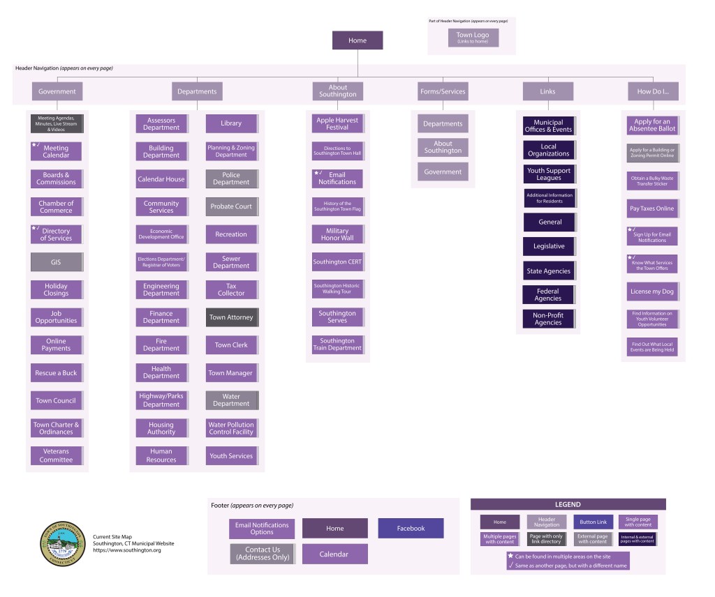
Below is the site map that I created along with a key (or legend) to show what each color means and even how different pages are represented.

Below is a higher resolution of the current site map
As I did my research and created the site map I noticed a lot of problems in the way it was organized. There were many pages that, when clicked on in the drop-down menus in the navigation, will bring the user to the same page as a different one. However, while it is acceptable to have a page in more than one place the title that the user first sees before they click on it, should be more helpful and not thinking that it will be a different page altogether. For example, there is a page under the “About Southington” section called “Southington Serves” that brings the user to a page that has volunteer opportunities for the youth in the town. Then there is a page under the “How Do I…” section called “Find Information On Youth Volunteer Opportunities” that brings you back to the same page, “Southington Serves”. While I was doing my research before, I was expecting more resources involving volunteer opportunities for the youth that included where to look for them, best ways to apply, or maybe how to start volunteering in general. I was expecting the pages to be very different where one showed the volunteer options while the other was to help in other aspects of volunteer work. Also, the section called “Forms/Service” brings the user to a page with three links that will bring you to “Departments”, “About Southington”, “Government”, or the “Department of Services” sections of the site, which is exactly what is in the navigation at the top of every page. Not only that, but that’s all that’s on the page which gives no help to the user. I was even expecting some important forms or services that won’t be found anywhere else on the site, or forms can be easily found for those in a hurry.
Revising the Site Map
With all of that in mind, I created a revised version of the site map for the website with the inclusion of my ideas as shown below.

Below is a higher resolution of the revised site map
One of the first pieces I found to be missing on every page was a search bar and a section for FAQs. The search bar can only be found on the home page, which isn’t useful for those that quickly need it when they are somewhere else on the site. From there I got rid of some of the navigation and replaced it with ones that would make more sense to the user but also kept some of the originals. So, now, the user will see, at the top in the navigation, the sections called, “About”, “Departments”, “Government”, “Businesses”, “Residents”, and “Resources”. The about section will hold all the history of the town as well as important facts and information to know including directions and contact information. The department section will still be very similar except for combining similar departments into one larger section. I reduced the number of pages that a user sees so it’s not too overwhelming and combine it into one section so everything that would normally be grouped would be there. For example, instead of having the health, fire, and police departments shown separately, I combined it under a section labeled “Emergency Management Services”. Then the “Government” and “Business” sections will have important information that will be needed under each one that only pertains to each section so the user can easily and quickly find what they need. From there, the “Residents” section will have everything imaginable for the user to find helpful information about being a resident in Southington, CT, from the library, recreation, housing, schools and education, birth, death, and marriage certificates, or even volunteer and job opportunities are just some of the information the user can find. With the last section, “Resources”, the user can find any forms they need to fill out, helpful tips and information when it comes to voting, business, the government, or making a payment online are just some of the numerous resources that the user has on hand.
All in all, Southington’s municipal website, while it’s good right now, I can use a lot of updating and reorganizing to give the user a better experience when they use the site. After all, if they have an easy and great experience on the site then the better the odds are that they will want to visit the town or set up shop whether it’s a business or residence because everything runs smoothly and they will be happy in the town for any reason.
Resources:
- Babich, Nick. “Information Architecture Guide for UX Architects & Designers: Adobe XD Ideas.” Adobe XD Ideas, 24 Nov. 2020, xd.adobe.com/ideas/process/information-architecture/information-ux-architect/.
- Klancar, Pia. “An Excellent Beginner’s Guide To Information Architecture.” A Beginner’s Guide To Information Architecture in UX (2021), 20 Jan. 2020, careerfoundry.com/en/blog/ux-design/a-beginners-guide-to-information-architecture/.
- Tubik. “Information Architecture. Basics for Designers.” Medium, UX Planet, 25 May 2017, uxplanet.org/information-architecture-basics-for-designers-b5d43df62e20.