
Web design allows for everything to be large and easy for people to read what they need and have an easy time finding everything. However, when it comes to an app on a phone it becomes more challenging for the obvious reason, the size. More and more people nowadays are always on the go and always on their phones. Just by walking down the street, you can see almost everyone with their heads down on their phones. Due to the growing need for smartphones, the need to have a business and even information ready and accessible on a phone dramatically increase.
With these needs comes a demand for a well-designed app that is functional across different types of phones (i.e. iPhone, Android, etc.) and usable for everyone of all ages. However, there is more to take into consideration than one may think when designing an app for anything especially when it comes to the user experience and it all begins with how it’s all organized.
Key Elements to Remember When Designing for an App
Screen Size
Unlike a computer screen, which can get large depending on what it is being used for, a smartphone has a small screen in which the app needs to adapt and be able to still be used and be similar to the website version. Due to the dramatic change in screen size, it can become crucial in having special features and buttons to help the user navigate around and complete different tasks as easily as possible.
Do Not Clutter
With the smaller screen size, there is less room for the information to be on. While you want to make sure the user has all the information they need, it is important to not clutter everything onto the screen at once, or else it will become very overwhelming to the user as everything is squished together on a tiny screen. Doing it in chunks and having a simple yet well-designed look to the app can help tremendously.
Organization of the App
The creation of information architecture for an app is just as important as the one for a website on a computer. With the smaller screen size, everything on the app needs to have a specific place for the user to find it easily and so they are not overwhelmed right away when they open it. It’s also important to have it similar to the website so it becomes an easy transition for the user from the computer to their phones. Also, because everyone is constantly on the go and their lives can become very hectic at times, it is important to have the information in different areas of the app that makes the most sense and is obvious for the user. This is so they do not spend a lot of time searching for it when they need that extra time for something else.
Information Architecture for Companion App Process
As I have mentioned before in a previous blog post, I created a site map for the town of Southington’s website (https://www.southington.org), in the way it was organized currently and a different site map showing a new way to organize it all. As I was doing the research and creating the information architectures, I realized just how many people are on the go, who do not always have time to sit down, connect to the Internet, and find what they need to, or even have a laptop to have with them at all times especially when they can become irritating to carry around all the time. For this reason, I decided to create a simpler version of Southington’s website into an app where the users are still able to find what they need and it is more readily available than it is on the website. Below shows my information architecture for the app.
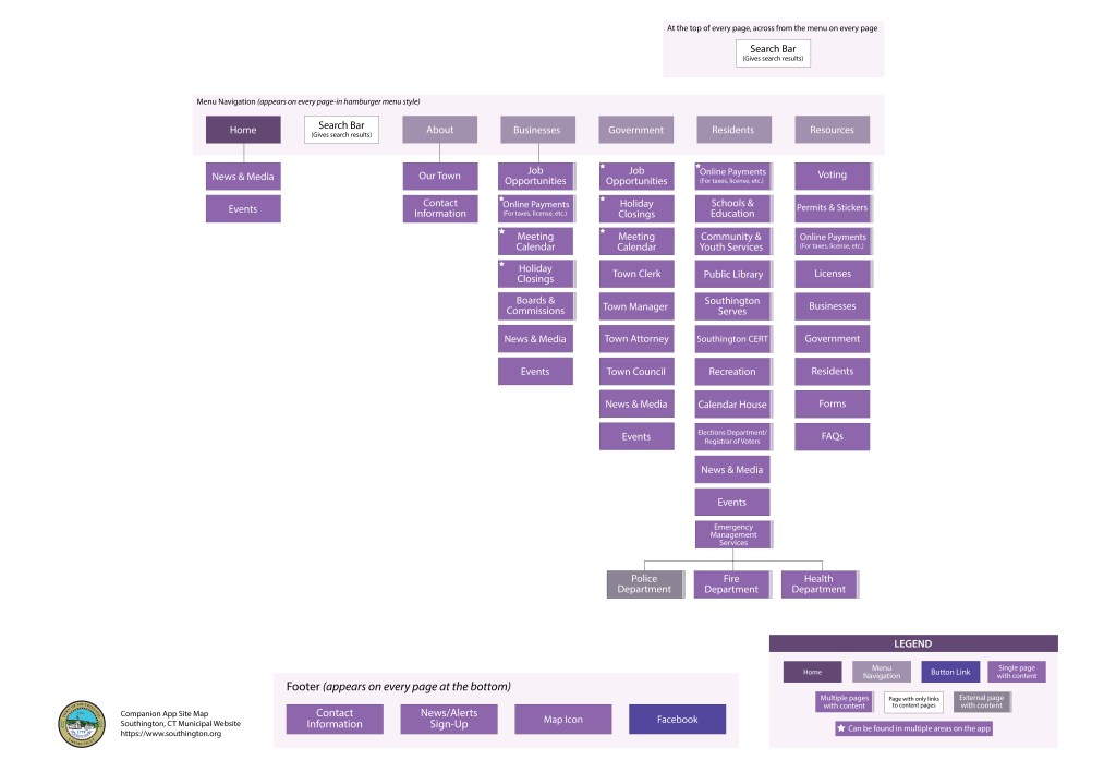
Below is a higher resolution of the site map
While the app has everything from the website, I didn’t include every single page from the website. The app will mainly focus on getting the user to what they need as quickly as possible while having what they will need on the go and keeping everything else for the desktop version. That is why the site map for the app, while it has the same information, is smaller and organized easier for a phone.
Within each section the pages that are there are the more popular and used pages, and were the pages that I found would be the most helpful for people on the go when they need information on the app. I also included a section for news and media since people are always looking at any news and media that pop up on their phones no matter what it is or where, so I thought it would be good to have on the app and especially as the first thing they see when they open the app. Everyone wants to know what is going on and what events are happening, and so having that readily available is ideal for the users. While the resources are good to have on a site and can be overwhelming on an app because there is much information. So for the app, I decided to narrow it down to the more relevant resources people would want to have on the go if they needed it. While I may add or remove pages once I am designing the app and new ideas are taking shape, the site map is a great starting point to make sure everything will flow smoothly and the users will have a great experience with it.
Resources:
- Babich, Nick. “A Comprehensive Guide To Mobile App Design.” Smashing Magazine, 12 Feb. 2018, http://www.smashingmagazine.com/2018/02/comprehensive-guide-to-mobile-app-design/#top.
- Deshdeep, Nitin. “App or Website? 10 Reasons Why Apps Are Better.” VWO, 12 Feb. 2021, vwo.com/blog/10-reasons-mobile-apps-are-better/.
- Imrich, Lukas. “Designing for the Web vs. Apps in the Mobile Era.” Medium, Medium, 28 Sept. 2015, medium.com/@strv/designing-for-web-vs-apps-in-the-mobile-era-a7c2fff654df.
- YS Community. “5 Key Differences between a Website Design and an App Design.” YourStory.com, Yourstory, 12 Dec. 2016, yourstory.com/2016/12/differences-app-website-design.
 Michaela Ganezer