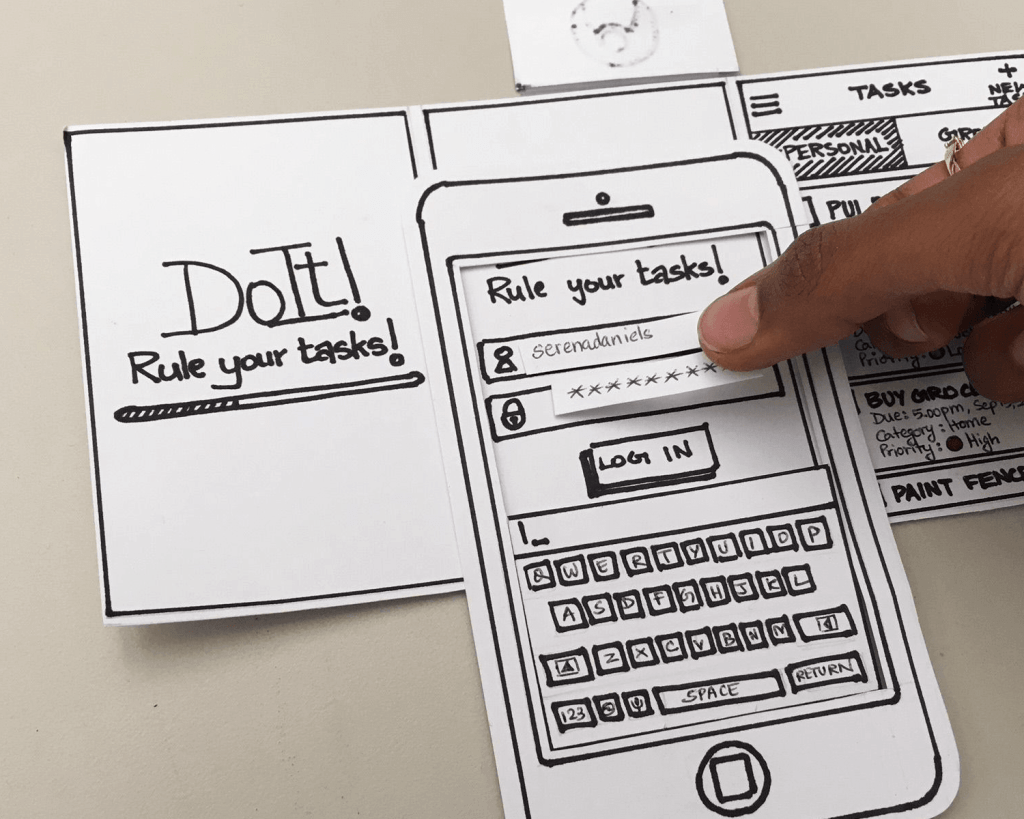
What is a low-fidelity prototype?
Creating the app perfectly is still too soon. Instead, creating a much simpler prototype is the next step. A low-fidelity prototype allows for the designer to plan out and give some possibilities of what many of the screens would look like through every little detail and little to color. Graeme Fulton says “However, starting with paper removes a lot of those technical barriers, as it’s just about getting your ideas out early on. It doesn’t matter how good your prototypes look either- as long as they help communicate your ideas, which is the main purpose.” Visually seeing what the app can possibly look like will allow one to see if they need to create more screens to make it easier to go from one step to another, or to make sure the user will have a good experience with the app that includes making sure everything is large enough for the mobile view and has enough parts on the screens to navigate around.
Having the prototype done on paper allows to easily see what ideas will work and what would not work. It also allows for the ideas to be presented without having to worry about “pretty” and very detailed drawings. Getting hung up on all the details, no matter how small, takes away from what is supposed to be happening throughout this step, seeing what will and what would not work within the app. Otherwise, if people are critiquing the details and drawings more than the ideas for each screen, then the feedback would not help to make sure the app is helpful and useful for the users, and the users will not want to keep using the app.
Updating the App IA
In a previous post, I talked about the information architecture that I came up with for the app for the town of Southington. Since then I was given feedback and I was able to spend more time on creating the app and taking more time understanding what the user would want in an app for the town. After taking another look at the app’s IA, I decided to change the app’s information architecture to make it more usable for the user without it being overwhelming for them. Below is the new, updated version of the app’s IA.

I decided to remove the whole section of resources that includes extra help for whatever the user may need help on. I removed this part of the app because if the user ultimately needs more help on filling out a form, permit, or extra help on anything else then they would turn to a computer and look it up on the website instead of trying to figure it out on a tiny screen.
Throughout the redesign of the app’s IA, I kept asking the questions, “what would the users really want to have in the app?”, “can I combine any more of the sections?”, “would the users want to have these sections on the app?”, and “where would the users look for these sections first?” Once I redesigned the IA I realized just how much the original one was very overwhelming for an app that should be fairly simple to navigate around and find what they need very quickly.
Creating the Paper Prototype
Going into the paper prototype was overwhelming at first. There are so many ideas and different ways to create the looks for each of the screens. I wanted the users to have options, but not too many options that they will get confused, which is why I incorporated the bottom navigation tabs that we see on many apps as well as the hamburger style menu (three lines at the top in the corner) that will help the users navigate around the app. In order to get a good idea if my ideas work or not is to create the screens that would be needed to complete different tasks. I created the screens that would follow the flowcharts I created before for three different possible users of the app including a mother with young children (a resident), a business owner, and a younger resident. The three tasks I created the screens for, along with the other screens, are:
- “As a mom of two young kids, I want them to enjoy reading so I want to know if there are any events at the public library that encourage reading and reserve a spot if I need to, all on my smartphone.”
- “As a new business owner in Southington, I need to find and fill out a permit so that I can open my store, but I need to do it all on my smartphone since I am constantly on the go.”
- “As a high school student, I want to volunteer more so I need to find volunteer opportunities I can sign up for and submit right on my smartphone.”
In addition to creating all the different screens, I also cut out a template of my phone from cardboard to get that real feeling and look for the app. It will also come in handy when people test it out to see if it works because it will make them feel like they are really on their phone using the app.
Below is the key to better understand my screens, since I used icons and colors that represent different aspects that will help the users.
The Key:
The Colors
- Orange: Clickable tabs or bottom navigation
- Blue: Clickable buttons and icons
- Green: Clickable icons and screen comes from the side
- Yellow: Drop-down menus
- Red: Keyboard pops up to fill in information
The Icons
- Circle with ‘X’: Southington logo that links to homepage on every screen
- Magnifying Glass: Search icon on every screen
- Three Lines: Hamburger Menu on every screen
- The Bottom Tabs (In orange)
- House Icon: Home Screen
- Person: Residents Screen
- Building: Businesses Screen
- Gavel: Government Screen
Paper Prototype:
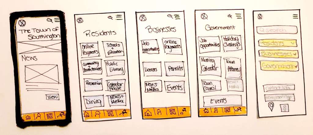
Going from left to right:
- Screen 1: Home Screen (Home icon from bottom tab)
- Screen 2: Residents Screen (Person icon from bottom tab)
- Screen 3: Businesses Screen (Building icon from bottom tab)
- Screen 4: Government Screen (Gavel icon from bottom tab)
- Screen 5: App Menu (Hamburger Menu-three lines in the top right corner of every screen)
Each screen shows what they would look like when they are clicked on using the bottom navigation and what the hamburger menu looks like. I wanted to make sure each screen was designed similarly to make it easier for the user to when they switch from screen to screen and doesn’t get overwhelmed and confused if they are dramatically different.
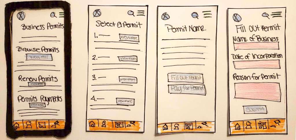
Going from left to right:
- Screen 1: Business Permits Screen
- Screen 2: Permit Selection Screen
- Screen 3: Selected Permit Information Screen
- Screen 4: Fill Out Permit Screen
Designing the screens like I did was to make sure it’s easy for the user to figure out how to do different tasks and not get annoyed because the user can’t do what they need to as easy as possible.
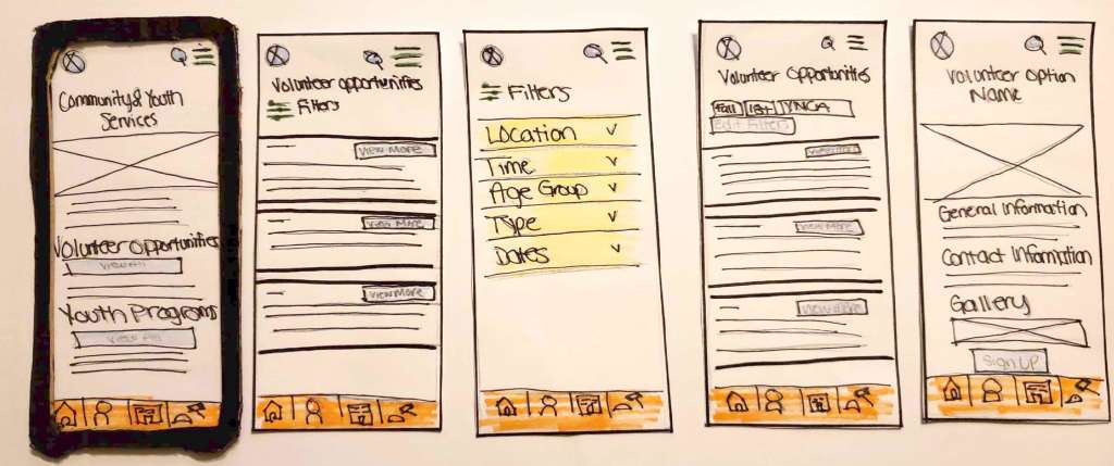
Going from left to right:
- Screen 1: Community & Youth Services Screen
- Screen 2: Volunteer Opportunities Selection Screen
- Screen 3: Filter Screen (to narrow down results)
- Screen 4: Filtered Volunteer Opportunities Screen
- Screen 5: Selected Volunteer Opportunity Information Screen
Selecting a volunteer opportunity is similar to the business permit selection to keep it the same design throughout the app and to keep it connected no matter where the user is in the app. I also included a filter option to help narrow down when there could be a lot of results to begin with.
Going from left to right:
- Screen 1: Public Library Screen
- Screen 2: Library Events Screen
- Screen 3: Selected Event Information Screen
- Screen 4: Event Sign Up Form Screen
- Screen 5: Submission Confirmation Screen
While the screens are similar to the ones before, I did add the confirmation screen where the user is able to go to different pages easily without getting confused how to in the first place. The confirmation screen will also be shown after anything is submitted throughout the app and not just for this task.
Going from left to right:
- Screen 1: Online Payment Screen
- Screen 2: Alert Sign Up Screen
The online payment screen can have a lot of information, so I created what the first screen would look like and I didn’t want it to overwhelm the user right away which is why I broke it up into sections and with buttons to have the user view more information about it. Then on the other hand, the alert sign up is one of the easier screens to create but still an important screen in order to keep up to date with what’s going on in the town.
Overall, the low-fidelity prototypes that were done on paper was very helpful in understanding what ideas would and won’t work and how the users would navigate through the app. It also helped to get my ideas out in a visual way that focused more on the idea and not getting caught up in the details and design.
Resources:
- Fulton, Graeme. “A Guide to Paper Prototyping (POP) – Create Basic Prototypes on Paper.” Marvel Blog, Apr. 2017, marvelapp.com/blog/stop-talking-start-sketching-guide-paper-prototyping/.
 Michaela Ganezer