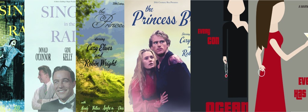
Creating Mockups to Choose a Path
After working endlessly on research by gathering as much background information on movie posters, creating mood boards to use for each movie that includes the chosen time period, and sketching out different ideas, it was time. It was time to move onto probably one of the scariest parts of design for many people, the mockup phase. Mockups are what the final design will look like that includes full color, type, imagery, and anything else that applies and is usually shared with clients. When creating mockups the number rule every designer should know is to always make more than one version. By doing so it gets ideas flowing and the final version of the design is usually always a mix of what really worked within the separate mockups that have been modified and put into one final design. Take Ian Spalter, the head of design at Instagram for example. In a Netflix episode of Abstract: The Art of Design, called Ian Spalter: Digital Product Design, he was tasked with creating a new logo that is updated, fresh, and modern for Instagram. As he was creating the new logo he and his team created thousands of other logos that lined the walls of the room there were so many. There were so many different versions to show different colors, shapes, patterns, and overall look of it. By creating these mockups Ian and his team, as well as the co-founder of Instagram, were able to narrow down what they thought would work best. As I was creating my mockups I wanted to make sure they were different enough that I could see what works and what doesn’t. However, due to time I was only able to create two different mockups for each movie, six in total (even though I could have done more), but I still used Ian’s method as inspiration. I do have to say though that figuring out the right typeface to use was very difficult because I had to use typefaces that was popular or around during the time period of the posters. I also had to keep in mind of which typeface to use that would expresses the genre of the film. Having the wrong typeface is just as much of a big deal as the rest of the poster because if it doesn’t match the genre then there is a disconnect and doesn’t look very good overall. For example, having a horror movie style typeface on a poster for a young kids movie will send the wrong message and just look extremely bad overall. Also, I had to keep in mind of the styles and look of the posters in certain time periods that they will be portraying. Throughout creating these posters I ran into many obstacle, however, I overcame them and eventually created well-designed posters for a different time period.
Creating Singing‘ in the Rain Poster Mockups
The time period I decided to go with to create the poster for Singin’ in the Rain is the 21st century and in particular between 2016-2020 since they were similar for the genre of a musical – comedy. Since this film is an upbeat, funny, and somewhat romantic film, I wanted to keep the color scheme light and happy like using light blues and yellows. I also wanted to capture the rain aspect of the movie onto the poster in that in one poster I used a fog or mist like effect and in the other I used the actual image of Gene Kelly singing in the rain. After looking at other movie posters in the same genre from 2016-2020, I realized that the basically all used actual images of each character that they wanted to display on the poster and many used the same set up of the characters as well. So keeping in theme I tried to get the best quality images of each character, however it was tricky because the film came out in 1952 and the quality wasn’t as good as it is today. After a long time of finding the right images I removed what I didn’t need and kept what I wanted. In one poster, I used all three characters in a pyramid like formation with the most prominent character (Gene Kelly) upfront and large and the other behind him a little smaller. While in the other poster I used Gene Kelly singing in the rain with an added effect. Even though there were obstacles with images and color, I believe I managed to capture the rain element and the genre of the film within the posters.


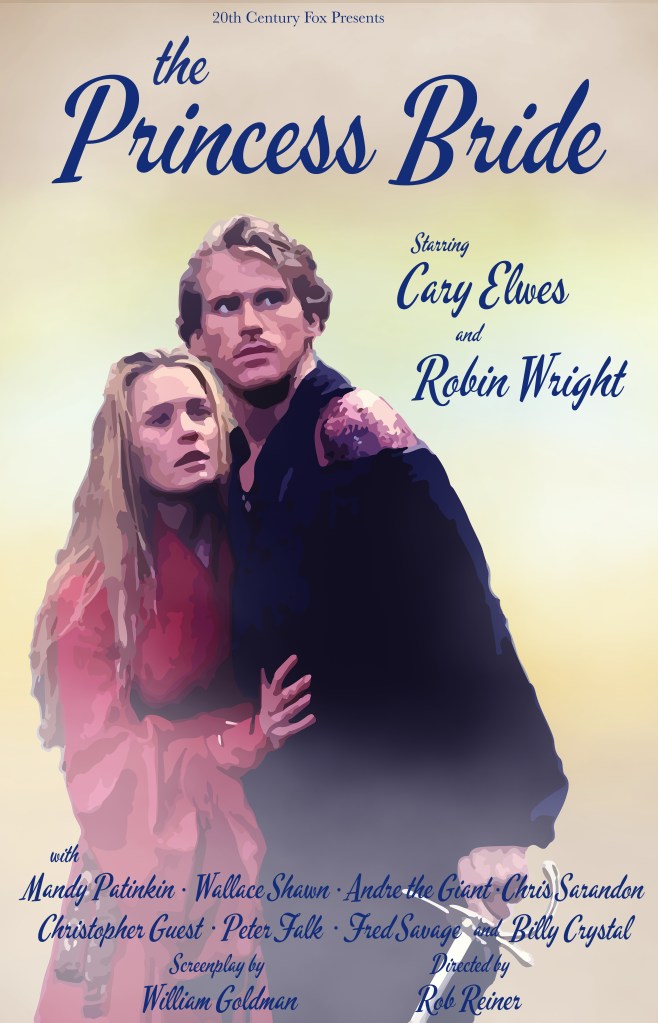
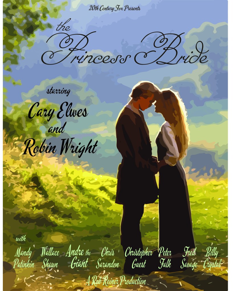
Creating The Princess Bride Poster Mockups
Moving onto The Princess Bride, I knew right away that I wanted the color scheme to be an earthy color scheme meaning I wanted to use greens, blues, yellows, and tans. The chosen time period for the poster was the 1940s. Looking back at the inspiration, the posters from this time period was a mixture of a realistic look with a cartoon feel. Since this film also fell into the fairytale adventure genre, I used clouds (or a fog like look) in one of the posters to make it feel like a fairytale or like it’s a dream coming to life. In both poster I used actual images from the film but added a texturized effect to it that makes it cartoon like or like it’s painted on to keep in theme of the time period. In addition, I really wanted to capture the fairytale of it by having a cursive and a calligraphy style typeface that immediately makes you believe it’s a fairytale at first glance.
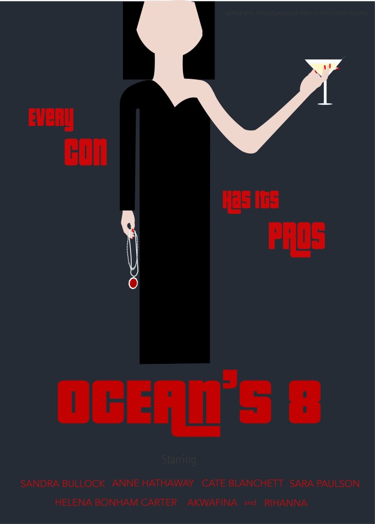
Creating Ocean’s 8 Poster Mockups
Designing the look for the Ocean’s 8 movie poster was the most interesting to create and explore. When I gathered the inspiration and examples of movie posters from the chosen time period of the 1960s and for the genre, I saw that there was a mix of using the actual characters and a more illustrated look. Since I love to draw I wanted to challenge myself to see what I can create, so I drew in a cartoon style for both posters but style having them be different from each other. The film is all about people manipulating and coning other in order to get what they want without anyone knowing what they are doing until they are long gone. In order to capture the two-sided persona, I split the poster or person into two. For example, in the first poster I created it shows a women drinking and hanging with a man while she is hiding jewelry behind her back to be sneaky about it like the cons in the film. Then in the second poster, it’s split where in one hand she is holding two necklaces with the words every con near it showing that it was probably stolen or isn’t hers. While her other hand in a drink with the words “has it’s pros” near it telling the viewers that she is the pro and no one would expect she is a con. As I try to capture the con or crime part of the film, I also wanted to have a dark color scheme using only black, greys, and reds. In addition, the font that I found has a 1960 feel to it and shows of the crime side with some of the letters having a “tail” like feature that goes under the next letter, almost like it’s being sneaking which relates to the film as a whole.