THE FINAL DESIGNS ARE NEVER FINAL
Graphic designers creates sketches on top sketches and mockups on top of mockups to have more than one version of an idea or concept. During the process of creating the final designs, the sketches and mockups are constantly being referred back to and used with some changes and improvements. To sum it all up, the ideas and concepts are constantly changing and evolving which is what we, as designers, do with final designs. Within a project, after the mockups where one of the mockups is chosen to be worked on more, by the end there is always a final look to whatever is being created. However, that final design may have gone through hundreds of changes before it got to what the public gets to see, whether it was changes in colors, typefaces, spacing, or even size.
How many times do you get something back so you can fix or change things? How many times do you change a few things here and there on a project that you thought you finished and was ready to be handed in, but found some things that can be improved before someone sees it? No matter who you are or what you do, you are constantly improving the project, even when we think we are done. How many times do you hand something in and then wish you did better on it and thought of something that could have made it better? Even designs that you see everywhere from logos to package designs to a pamphlet are constantly changing. Designers put out what they believe to be the final look and design of something but then years down the road they revisit it to give some new updates and improvements. At first the initial design that the public sees is the final design. However, it is never truly the final design. Designers always have to keep in mind as they are creating a project that the final design is never the final design there is always something that can be improved.
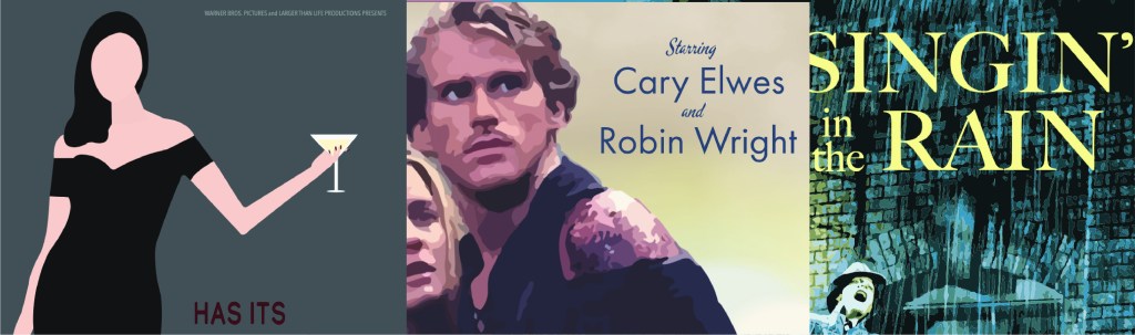
THE POSTERS ARE ALMOST THERE
I ran into the same obstacle in the mockups as I did in the final designs. That obstacle being typefaces or fonts as many people know it by. Tina Lombardo states in her article “Why Font Choice is Important” that “The font you choose can have a profound effect on the people reading the words you type. So, the perceived meaning can change drastically depending on the font choice.” This is very true as I continued designing the posters because as I was choosing the typefaces that I wanted to use I noticed that some went more with the theme of the film and really captured the film as a whole, while other typefaces did not.
Take the movie theater as an example. As you are walking to the correct theater there a tons of movie posters for current and upcoming films lined on every wall, as well as some cardboard cutouts for the film. As you notice them you get a feeling of what the movie is whether it is horror, family, romance, comedy, or a different genre. Whatever genre it is, you walk away from it with a feeling from it and it is not just from the imagery of the poster, but from the title on the poster even if you may not realize it right away. For the most part, not many people realize that the poster has an effect on them, but it does stick with the person and may have an impact in whether or not they go to see the film. Think about it. How many times have you seen a product in the store that caught your eye and probably even bought it because it had an interesting font that made the words look interesting whether it was clothing, a book, or something else entirely?
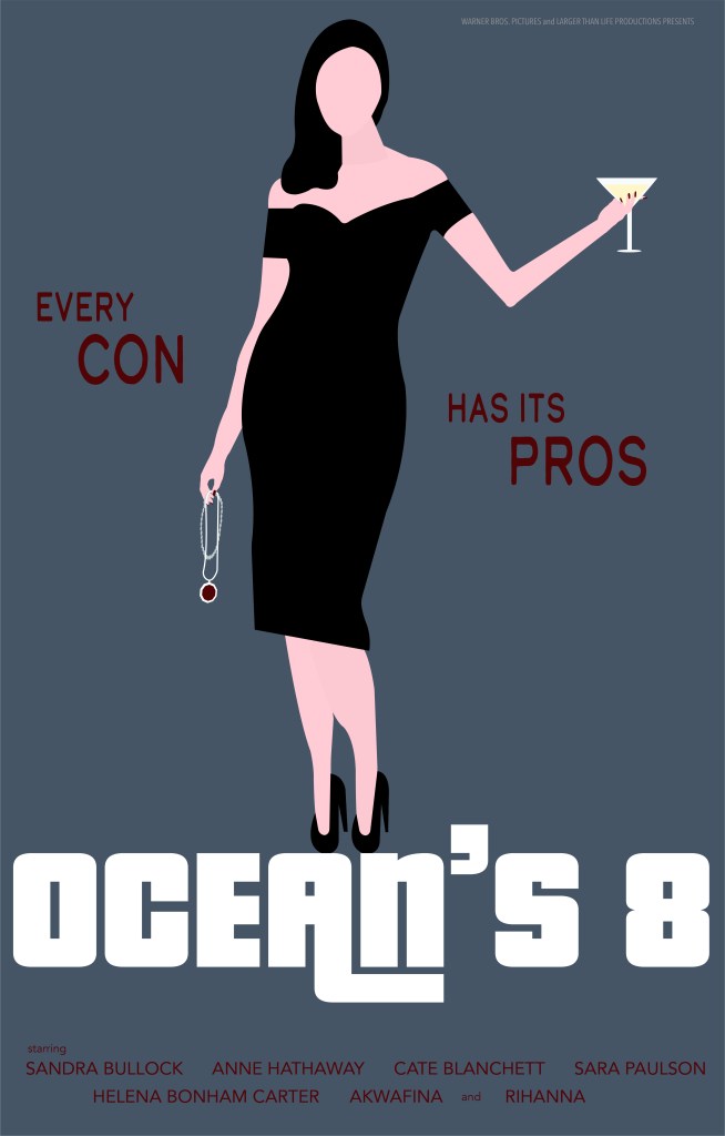
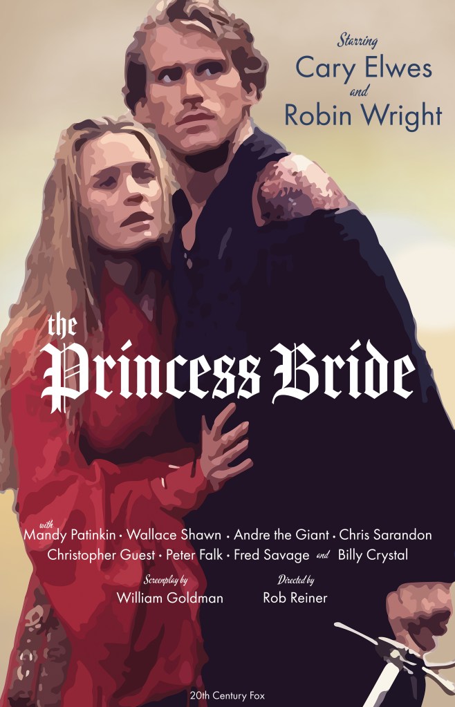
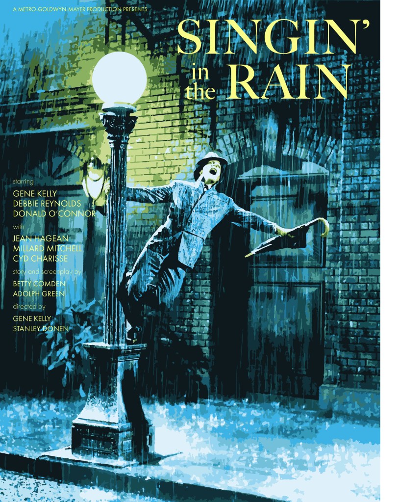
As I was choosing my typefaces for my posters I really had to think about not only the typefaces to portray the genre, but what which typefaces blended well together that portrayed the same intended message and had it feel like it was from the chosen time period. One of the breakthroughs I had was for The Princess Bride poster. At first, I intended for the title to be in a calligraphy style that is in script but with some of the lines of the letters extending into an captivating design that makes the audience know that it is a fairytale and romance film. As I went through the never ending list of typefaces that I had for what seemed like hours and hours, I came across a different style of typeface. It had that style that you see in the beginnings of the old Disney princess movies like Snow White and the Seven Dwarfs or Sleeping Beauty on the storybooks that would appear first, mixed with a medieval feel to it. Once I saw the title in this typeface I immediately had the feeling that the film was a fairytale, romance, and adventure all in one. However, my word alone wasn’t going to cut it, so I tested it out on my family members and they had the same reaction to it and since they have seen the film, they thought it really captured the essence of the film. Overall, after hitting a few obstacles and spending hours choosing the right typeface and improving on one of the two concepts for each poster, I was finally able to create a better and interesting poster designs.