MINDSET BEFORE
Creating designs that I can be proud of can be extremely difficult for me. I am never satisfied with any of my final designs, yet again who is. Ever since I was young I was always hard on myself and wasn’t always the best thing. On one hand being hard on myself allowed me to push myself, take on challenges, and think outside the box. However, on the other hand being hard on myself gets me frustrated the minute something isn’t going the way it should or the way I need it to, and it makes me second guess myself every step I take. Whenever I second guess myself I am holding back what I can be capable of doing because the same questions and comments go through my head each time that includes:
- Is it good enough?
- Will other people like it?
- It’s awful
- I’m not good enough to design this
- Why isn’t this going right!
Being like this for all my life, made me a perfectionist which again has its advantages and disadvantages for me especially when it comes to design. While being a perfectionist allows me to be detail oriented. However, it made me hold myself back because I was so focused on where the type and images should be, how large or small, and if it looks like it should or not. By focusing on the small things, I had a hard time looking at the big picture and just being creative and having fun.
LEARNING MORE ABOUT MYSELF
Once I took on this project, this all changed around for the better. While I was still second guessed myself and was a perfectionist at times, it was the good side and not using it as my crutch during the design process. I grew as a designer in ways I never thought I would with a seven week time frame. Throughout this project I learned to not to be such a perfectionist because by not doing so I was able to think outside the box more and become more creative. In return, I started coming up with new and better ideas with each task and step. Without second guessing every choice I made I learned to take risks and challenge myself and by doing so I put out ideas that I probably would not have done or it would have to have been forced out of me.
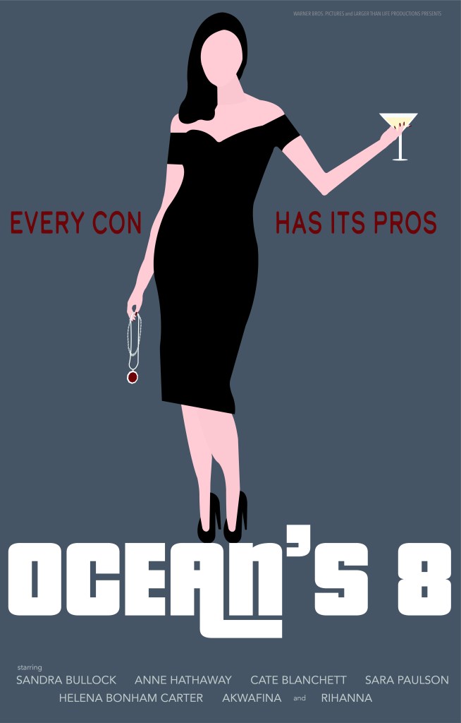
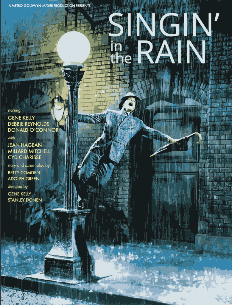
This project came with two rules, one, the project needs to be able to be done in seven weeks, and two, it can be anything your heart desires. After I got this I knew right away that I wanted to combine my passion for design and film somehow. From there I was able to come up with movie posters for three films that I love and enjoy watching. However, I wanted to challenge myself that I can have fun with while improving my design skills and is professional for future employers to see. The challenge was to have the movie poster designed like it’s from different time period. So if the film was released in 2019, then the poster will look like it is from the 1960s. Giving myself a twist or a challenge in this project allowed me to have fun. I learned that when I actually let myself be relaxed and enjoy what I am creating, the possibilities are endless.
ADDING THE FINAL TOUCHES
At this point, all of the final details were added or fixed. Throughout the process of creating these movie posters I ran into the same problems multiple times. These problems included readability, choosing the right typeface, choosing the right color, and keeping it looking like the chosen time period. Within each phase of the project I kept struggling to figure out how to make sure the names were readable even though most of the time they are not in many of the posters we see today. Also, many typefaces that I thought would really go with the film did not appear in that time period so I had to continue, for what felt like days, to choose a typeface that is exactly or similar to those seen in that point in history. What really helped throughout the process was returning to my research and visual mood boards for inspiration to strike.
The videos that Vanity Fair did with James Verdesoto, an actual movie poster designer, who has created some of the ones we know and love to this day including Pulp Fiction and Ocean’s Eleven, has helped me tremendously. These videos includes Every Marvel Movie Poster, Explained, Movie Poster Remakes vs. Originals, Explained, and even Movie Poster Expert Explains Color Schemes. As I was watching these videos, James really broke down the posters and explained the reasoning behind what the designer chose to do for that poster. I was able to take what I learned from James and apply it to my posters even if it wasn’t the same genre for the poster. Overall, I learned a lot about myself and movie posters throughout this process and I was able to overcome obstacles and create interesting movie posters with a twist.


